I've played with Top Trumps before so I know a fair bit about the layout and general content of the cards, but I'm not sure of the distribution. I wouldn't really know where to go to buy a pack, so I googled - 'where to buy top trumps cards'
>Tescos
>Sainsburys
>ASDA
>Waterstones
>WH Smith
>Toys R Us
>The Entertainer
>HMV
>Wilkinsons
>John Lewis
>Amazon/eBay
>Top Trumps website
And probably more, but that's all that I could find
So it seems they have quite a range to distribute from. The thing is that my cards aren't really appropriate for somewhere like Toys R Us. So mine will have to be a lot more niche, or sold to joke shops like Hawkins Bizarre or shops that have an over 18 section (although I think over 16 is fine for my cards but that's the government for you).

Tuesday, 29 March 2016
Monday, 28 March 2016
OUIL505 I'M DOING TOP TRUMPS

TOP TRUMPS, I'm going to make Top Trump Trumps. I've thought of this idea aggessss ago right in the beginning of the module, but for some reason that I don't really understand I just didn't carry it through. I think because in 504 I ran with my first idea so I think I wanted to see what else I could do before doing one of the first things I thought of. Anyway, I started listing possibilities of cards that I could do, what different styles of Trump could I do? I think in the time span that I have, I think I'd only be able to do around 10, seeing as I have to hand paint each illustration (which takes a while) and come up with different information as well.
So I did a little tester (left page) to see if this could be a good idea. And I noticed that this, I think, is a way of adding to the satire because I also have words to back up the image. If I really nail the categories and the short piece of information on the card, it could make it a lot funnier than just having the image.
Now I need to research about Trumps.
Tuesday, 22 March 2016
Responsive Collaborative - Last leg
Submitting work! I couldn't be with my group today as I had a surprise trip out for my birthday so annoyingly I couldn't be with my group which I feel bad for, but I suppose it can't be helped! They did an amazing job on the design boards and had made an app and posters to go with the packaging and magnets. I think this was a great idea as hopefully this will really make us stand out against other competitors.
After having the work submitted it feels strange. I'm relieved that we finally had everything done and we can kind of relax, but it's a bit sad that it's all over because I liked the team that I was in and think we worked really well together. I think I was very lucky, as I have heard horror stories from other team members. But I don't think I showed off my illustration skills enough in this project, as it was quite a graphic design heavy brief. However, it made me learn a lot by just watching how they work and how they go about working on the brief. They taught me about the importance of typeface and how to create mock ups of my work which I am very grateful for. Although next time I really need to read the brief properly before I choose it, as none of us really knew what we were getting in for. But I'm going to take this as a learning curve instead of something to get stroppy about.
FINAL THOUGHTS
After having the work submitted it feels strange. I'm relieved that we finally had everything done and we can kind of relax, but it's a bit sad that it's all over because I liked the team that I was in and think we worked really well together. I think I was very lucky, as I have heard horror stories from other team members. But I don't think I showed off my illustration skills enough in this project, as it was quite a graphic design heavy brief. However, it made me learn a lot by just watching how they work and how they go about working on the brief. They taught me about the importance of typeface and how to create mock ups of my work which I am very grateful for. Although next time I really need to read the brief properly before I choose it, as none of us really knew what we were getting in for. But I'm going to take this as a learning curve instead of something to get stroppy about.
Friday, 18 March 2016
Responsive Collaborative - Finals photographed
After printing off our final packaging and putting it together, we had to get it photographed. This is something that I would have not been able to do by myself, as I'm pretty clueless with it. But luckily Cameron is quite comfortable with the camera and Laura and I helped with the lighting and the composition of the packaging. This has taught me how to use proper lighting, and that it is not as hard as I expected it to be which is great because it means I can do it myself another time. Although it was a lovely sunny day and St Patricks day so having to stay in to photograph our work is not what we wanted to do!
I am really happy with how these photographs turned out, I think Cameron did a really good job! I think our packaging looks really professional and I am excited to send them off!
I am really happy with how these photographs turned out, I think Cameron did a really good job! I think our packaging looks really professional and I am excited to send them off!
Tuesday, 15 March 2016
OUIL505 Response to feedback
Coming back from the group tutorial, I think that I just need to get drawing. I want to look more at the campaign itself, like the merchandise and I need to look at Trump's twitter to see if I can illustrate stuff he says and where it may take me.

I really enjoyed doing these sketches, because I think I came up with some stuff that I could use later in my work without really having to think about it, I just drew what came straight to my head. I think it's something that I need to start doing more if I become really interested in editorial in the future, because it is a quick process.
OUIL505 Last feedback before Easter
Group tutorial:
>More research into political comics
> Develop themes
> Plan out 3D models - sketches
> Make a persuasion satirical book? - excessive campaign/posters/flyers
> George Orwell & Gerald Scarfe
> Check out Trump's twitter
>More research into political comics
> Develop themes
> Plan out 3D models - sketches
> Make a persuasion satirical book? - excessive campaign/posters/flyers
> George Orwell & Gerald Scarfe
> Check out Trump's twitter
Responsive Collaborative - Finals
We had to have a break up in the work due to the Berlin trip, but after they got back we met up most days to get it all done!
We struggled a lot with doing the front cover of the packaging, as I previously stated the fish were awkward to work with. We played a lot with the type than came to the conclusion that we didn't actually need it as all the info was on the sides and will be on the back. We decided that we should incorporate the brusho textures that we made right at the start of the process so would make the front more eye-catching and make use of our early work.

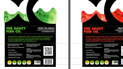
We struggled a lot with doing the front cover of the packaging, as I previously stated the fish were awkward to work with. We played a lot with the type than came to the conclusion that we didn't actually need it as all the info was on the sides and will be on the back. We decided that we should incorporate the brusho textures that we made right at the start of the process so would make the front more eye-catching and make use of our early work.

Our final packaging! We had a look at other packaging boxes to insure that we had everything that we possibly needed to go onto it. Laura did all of the back of the box, with guidance from the rest of us to make sure that we were all happy with the result. I'm really happy with the way that we worked, as we did the work in a way that everyone was involved rather than all going off and doing different things then coming back together. We thought by doing it together we'd be a lot happier with the result and would work better as a whole instead of looking mismatched. I don't that our packaging would look as good if we didn't do it in the way that we did, this has taught me the importance of team work and I'm so glad I was part of this hard working team.

Sunday, 13 March 2016
OUIL505 Format tester
Before I find another article to illustrate, I wanted to redo my clay figure pig trump that I made as a spot illustration in the style that I did before. I just wanted to see how versatile I could make my illustrations.

I think that these definitely work better as editorial illustrations, as well as taking a lot less time to produce. I think time management is something very important to consider, especially for editorial work as it's something that requires work quickly with strict deadlines.
Thursday, 10 March 2016
OUIL505 'Trump has small hands'
I wanted to try and illustrate another article, but thought I should do maybe a clip/video of something that happened rather than a written report. I had found this clip from beforehand when looking at the election campaign as a whole and seeing the excessiveness of it all.
https://www.youtube.com/watch?v=tOX6aIEV5kE


https://www.youtube.com/watch?v=tOX6aIEV5kE
I wanted to use a different material to try and see what would work best, starting with pencil then moving onto gouache. I was really liking the gouache, as the colours emphasise his horrible pinky skin and slimy personality.
These quick illustrations led to this, which I really like. I think this painting style is something that I need to keep exploring in my work. It's eye catching and different to any other editorial illustration. This means that there is a gap in the market for work like this, so I definitely need to take this further. I'm going to keep on painting like this and find other articles that I can illustrate.
Tuesday, 8 March 2016
OUIL505 Testing out formats
I thought that I really needed to explore different formats using a relevant article. So I went onto the New York Times website and found the article about how the Pope doesn't think that Donald Trump is christian.
http://www.nytimes.com/2016/02/19/world/americas/pope-francis-donald-trump-christian.html?_r=0

I found a line in the article that the Pope said 'So at least I am a human person' which I thought could be relevant to my clay figure that I made of Trump that could be used as a spot illustration. As the Pope is implying that Donald Trump isn't human aka pig.

I then made a terrible mock up of what my figure could look like in context. Which is quite cool because I've never done it before, especially as I haven't really touched editorial ever. I definitely think this is something that I need to keep looking into. I need to keep drawing and maybe use other materials too like gouache?? As this is another material that I am quite strong in. I also need to find more articles to illustrate.
OUIL505 - Formats
As I've decided to do editorial and don't really know much about it or what I'm doing, I thought it should look at different formats that I could put my work into so they have more context.
Front cover

This is what I think my work so far would be best for. Ideally, I want my work to be big bold and eye catching - definitely not a tiny image in the corner. Also because I think that my final outcomes may take me a while to do if they're a clay figure photographed with a background, I would like it highly exposed.

But I sketched out some other formats which might be appropriate for my work. I think if I had a mixture of full page and spot illustrations then it'll even out my work load, because if they were all full page it'll take me ages to make/draw each illustration. I also thought of maybe doing top trumps of the different political figures, but not sure if that's straying off from editorial. But still a thought that might work.
I think I really need to start putting what I have so far into context to see how well/or not it will work in the editorial format.
Small brief - Penguin Random House - Submission Success
Submission Success
After a long battle with technology and a little help from fellow illustrators, I finally managed to reduce the file size and submit my work! Only took me a couple of months to work out.... but oh well! At lest I submitted it in time!

OUIL505 Just Donald?

https://www.youtube.com/watch?v=DnpO_RTSNmQ
I found this John Oliver video on Donald Trump (which is hilarious), which made me think that maybe I should just focus on Trump rather than doing all the candidates, as there's just so much information on him. He's given himself so much satirical material to work with, that he's kind of made in easy for me.
Just from this video it's shown/I've learnt:
>How much of a spoilt child he is
>Half of what he says doesn't even make sense
>Conflicted views
>Claims that his campaign is self funded
>Trump wasn't even his original surname - Drumpf
>How successful he thinks he is
>He thinks everyone loves him
>How sensitive he is about his hands
>How much money he lost, even though his dad was/is minted
>Values his own name as 3 billion
>How many of his businesses that flopped
>Trump means success to a lot of americans
So I think I have a fair bit to work with!
Monday, 7 March 2016
OUIL505 Where could my work be distributed?
I need to start thinking about where I could distribute my work, satirical newspapers/magazines?
>Acknowledge that I'm doing left wing satire
https://en.wikipedia.org/wiki/List_of_satirical_magazines
Looked at current English and American magazines
>The Onion
>Private Eye - UK most read news mag
>Spitting Image (not a newspaper but still political satire)
>Mad Magazine
>The Daily Mash
>The New York Times?
Private Eye?
I thought I should have a proper look at the private eye, as I've never really checked it out before.

I enjoyed reading it, and it was quite funny. But I don't think it's somewhere that I could put my illustrations, as they're very generic political cartoony and sketchy. Or they have the photograph with the funny speech bubbles. They also don't really focus on much American politics, just english, so annoyingly I don't think my work has a place here. I think the New York Times would be more fitting.
OUIL505 - Themes to explore? - Excessiveness
Something that I noticed when looking at the U.S election is the excessiveness of it all, especially when you compare it to the english election. You can see it just by watching the Fox news coverage of the election, why does it need all of these pop ups??? 'countdown to Nevada', it's just overly elaborate and not really necessary.

Again you can see this when they have the debate, why do they have a wembley sized audience and Xfactor style judge panel like they're about to perform in a boy band and stand off their stalls and sing 'you raise me up'

U.S election debate

UK election debate
Especially when you compare the two televised elections, it's clear to see how over the top the american version is - bit excessive? As this is something that I've seen that stands out a lot to me, I think it's something that I should definitely look at. Plus I think it could be something that might be fun to work with, especially with satire as I can completely enhance everything and use bright crazy colours which I enjoy doing.
ALSO!
It's just like a massive popularity contest at school! One of the criticisms that Trump was given by another Republican candidate is that he had small hands. Is this seriously an important factor to being a leader? Trump then responds to this by saying that his hands are not small and doesn't mean that his genitals are small.. how ridiculous. It's like being in the school playground surrounded by bullies, if you're going to criticise a candidate it should be about what they stand for not for any personal reasons. This makes me feel like it's all a bit of a joke and no ones really taking this seriously. This again makes me feel like satire is perfect to show what this election is like.
OUIL505 The US election research
Seeing as I'm focusing on the US election, I thought I should probably do some research into it, as I am not too informed on the subject.
>Don't have to hold office
>Each state will have a caucus (meeting) - vote for who they want to be in charge for each party
>Never had any left wing candidates - no socialists - considered to be like communism and a european thing.
Election day - second Thursday of November since 1845 (Nov 8th 2016)
>President lasts 4 years - allowed to be elected twice
2016 Election:
Democrats: Hillary Clinton, Bernie Sanders
Republicans: Donald Trump, Marco Rubio, Ted Cruz
>Republicans stronghold is in the south - trick the population into voting for them by talking about American values
THE US ELECTION
General Information:>Don't have to hold office
>Each state will have a caucus (meeting) - vote for who they want to be in charge for each party
>Never had any left wing candidates - no socialists - considered to be like communism and a european thing.
Election day - second Thursday of November since 1845 (Nov 8th 2016)
>President lasts 4 years - allowed to be elected twice
2016 Election:
Democrats: Hillary Clinton, Bernie Sanders
Republicans: Donald Trump, Marco Rubio, Ted Cruz
>Republicans stronghold is in the south - trick the population into voting for them by talking about American values
Hillary Clinton: 'Hillary for America'
>Wife of former president Bill Clinton
>Broad supporter from minority voters, LGBT voters and majority of white voters
>Focused candidacy on:
- Raising middle class outcomes
- Expanding women's rights
- Instituting campaign reform
- Improving the affordable care act
Bernie Sanders: 'Feel the burn'
>Most 'left wing'
>Uses social media as a platform for promotion such as Facebook & Twitter and even answers questions on Reddit
>Supporters liberal-leaning democrats & white
>Focused candidacy on:
- Fight the decreasing income of the middle class and the increase wealth inequality
- Investing in infrastructure and making it easier for workers to form a union.
- Opposed to trans-pacific partnership
- Global warming being a serious problem
- Supporter of universal healthcare
- No to war
Donald Trump: 'Make American Great Again'
>No political history - business man and tv personality
>No 1 Dick
>Focused candidacy on:
- Rebuild American infrastructure
- Building the Mexican wall - "Bringing drugs and rapists"
- Plan to defeat Isil
- Protected free market for Americans
- Tough on Iran
- Restore the American dream
Ted Cruz: 'Reigniting the promise of America'
>Just as bad as Trump, but no one seems to realise.
>Focused candidacy on:
- Restore the constitution
- Second amendment rights
- Defend their nation
- Secure the border
- Stand with Israel
- Religious liberty
- Creating more jobs - 'simple flat tax'
- Restoring a culture of life, marriage & family
Links:
Thursday, 3 March 2016
Small brief - Penguin Random House - Submission struggle
Submitting my work
I had finished my final designs for both books quite a while ago, but have been so busy the past weeks I haven't submitted them yet. Well, I have definitely tried submitting them, but the file size can only be 5MB and I can't get them down to the right size! As well as this I also have to create a two page pdf! I am stumped! I'm getting worried that I won't be able to figure it out and miss the deadline (9th March). I really think I'm missing something here, but surely I can't be the only one struggling with this. I understand that they must be getting a lot of submissions through but why make it so awkward for everybody!
Wednesday, 2 March 2016
Substantial brief - Secret 7 - Overall thoughts
Initially I was excited by this brief, as the prospect of being inspired by music to create a corresponding piece of artwork seemed exciting. But I quickly found out that it was a harder task than I anticipated. Especially if I had no connection to the song, which was usually the case. But I am glad that I decided to do all of the songs, because it meant I didn't just choose songs that I liked, pushing myself to try new things. It also meant that I had no choice to give up on it. I’m taking this as something to learn by, as it made me think outside of the box and encouraged me to be experimental. If I did find this easy then I wouldn’t have gained anything from the project, so I can only really be glad it challenged me. It also made me realise that I'm not as good as creating album covers as I maybe thought I was, but you'll never know what you're good at until you try!
Responsive Collaborative - Sixth meet up

Before the meet up, Laura had mocked up an idea for what the packaging would look like (without all the writing etc) which we were extremely happy with. We were glad that the acetate worked out as well as it did, this gives us good vibes for the final packaging!
So we got onto designing and roughing ideas for what our final packaging will look like on illustrator.

We all sat round the computer together and decided as a group where we should put the information and what type face would work best. I'm really glad that I am paired with graphic designers as they know a lot about this sector and I think I am learning a lot from them, especially type! This is just our first attempts of packaging, but we were struggling a lot more than what we expected. Especially with the front cover as it's really hard to work around the fish. Next week we will refine it a lot more.
Tuesday, 1 March 2016
Fashion Zine - Final small brief finished!
The final result

After a bit of tweaking, I am pleased with how these turned out, especially as I wasn't that happy after I first coloured them in. But that was just me wasting my own time because I knew that she wanted them bright and patterned so I should have done that the first time round, so I have no idea why I did that really. I'm taking this as a learning curve to actually listen to what the client wants so I can meet their expectations quicker. But luckily this brief was done in an informal way via Facebook, and I knew her through a friend so the pressure was off.
Overall, I am happy with my outcomes, mostly because of the reaction of the client as she was extremely pleased with what I had produced. This does make me realise that it can be fun and rewarding being an illustrator! Especially when you know that someone has benefited from my illustrative skills, it feels very nice.
I'm also quite impressed with my time keeping on this project, as I managed to produce it over the course of a weekend by scheduling myself to not going out and staying in and ploughing on my with my work. Also as she gave me a short time frame to work in (briefed on the 24th Feb and deadline 6th March) which makes it more like a brief that I might be given in real life as they usually give you a short time frame.. I think.


Also, as this falls into the editorial category, I am very proud with my outcomes. As I have never really been good at editorial and the thought of producing editorial work terrifies me massively. But this shows me that I can actually be capable of it, and I think I just had it in my head that I can't do it so shut it down before I really gave it a go. I will definitely take this with me into my other modules, maybe experimenting again with editorial work (even if it does still kind of scare me).
Substantial brief - Secret 7 - Imagine
I have left this album cover to last minute I'm not going to even pretend that I didn't. This is the song that I liked the least, as it's so well known and so over done that it's incredibly hard to come up with a new and imaginative (lol) idea. After listening to the song quite a few times, I had nothing coming to mind. I was even getting annoyed at the lack of inspiration I was getting from this song, which is why I had been putting it off for so long...
So I looked at existing album covers to get some inspiration:

So I decided to look at the lyrics, as this had helped me in previous songs.


So I looked at existing album covers to get some inspiration:
I really like how quick the drawing is, maybe I should do something similar but then what's the point in recreating something that already exists.
So I decided to look at the lyrics, as this had helped me in previous songs.
Imagine there's no heaven
It's easy if you try
No hell below us
Above us only sky
Imagine all the people
Living for today...
Imagine there's no countries
It isn't hard to do
Nothing to kill or die for
And no religion too
Imagine all the people
Living life in peace...
You may say I'm a dreamer
But I'm not the only one
I hope someday you'll join us
And the world will be as one
Imagine no possessions
I wonder if you can
No need for greed or hunger
A brotherhood of man
Imagine all the people
Sharing all the world...
You may say I'm a dreamer
But I'm not the only one
I hope someday you'll join us
And the world will live as one
I managed to pick out key words from the song, but still wasn't really sure how to put them together visually without creating something quite generic. But I really wanted to have my work inspired by this, or it won't link to the song.
I then thought, what about focusing on John Lennon himself rather than the specific song? He does have very recognisable facial features. So I drew him again and again and again
I ended up with this drawing, even though I wasn't too sure what I was actually going to do with it.
I like how you can tell who it is without using much, just some lines and shapes. I thought I should keep the album cover design quite simple seeing as the illustration is only a fine liner drawing. So I put it into photoshop
I went for the limited colour palette again! I just think it looks the smartest, too many colours I think can look quite childish. I then went for the circle to symbolise the world and eternity, which links into the lyrics of the song which I wanted to do. Although I think this design is still quite obvious and not out of the box enough. I think you can tell that I was not as interested in doing this song as I was about doing the others. But I suppose at least you can tell what song it is that I'm trying to visualise.
Fashion Zine - Final small brief - Process
After watching many episodes of Archer, I managed to churn out four illustrations! After finishing my first drawing the rest came a lot easier to me, which was a big relief. Especially after looking at different images of Bettie Page, getting the proportions right became a lot easier. I was very aware that I need to make sure that I didn't offend anyone, as the article is about body weight and average sizes so didn't want to draw a women too skinny or too large. I know that there's a few people on this course that would have probably done a better job as they've tackled this subject before and I honestly didn't really know what I was doing. But I did like the challenge, as there's no point just to keep doing the same projects just because I feel comfortable doing them. I also think that these are actually not too bad considering, especially as the client was very pleased when I showed her what I had done so far.

So I then scanned them into photoshop so I could colour them in digitally, so I could easily change the colours if the client wasn't happy with what I had created.

But I think I had slightly rushed these, as she asked them to be bright and colourful so I'm not too sure on the colours that I've chosen. But I decided to show her what I had done anyway just to see if her opinion matched mine. As I expected it did, asking for more patterns, pastel colours and bright coloured hairstyles. And this is why I coloured them in photoshop as I found it very easy to then change the colours of my design.
Subscribe to:
Comments (Atom)