Monday, 25 January 2016

Responsive Collaborative - First meet up

Research 

On our first meet up session, we thought that before we started doing anything else that it was important to see first hand what's already out there. We particularly wanted to look at how shops display their products, in terms of shelf space and size of the packaging and what type of packaging is most popular. As well as looking at current Saucy Fish packaging, we wanted to look at other market own brand fish, to see if there was much difference. With all this in mind, we headed to the supermarkets in town.


We managed to take a lot of pictures before the lady in Morrisons told us that we weren't allowed to, so luckily we had enough research by then. We saw that most of the packaging uses black - a colour that makes the product feel premium and luxurious. This is definitely something that we should consider when designing the packaging, although Saucy Fish already uses black packaging, so maybe  we want to think of something completely new instead of regurgitated.  We also noticed that most, if not all, packaging uses a cardboard sleeve - we want to avoid this as we want to pop out off the shelf instead of fade into the crowd. They all use plastic too, which is something that we would want to avoid seeing as the brief highlights the use of economic materials. 


We then decided to go to the library to see other packaging styles and ideas, as we had never made packaging before so still a little clueless to the concept. We wanted to see how it's changed through the years and if we could take some ideas for our own packaging. Particularly looking for something imaginative and different. We found the New Packaging Design book the most useful, as it has a lot of clean cut and smart looking packaging which I think is what the Saucy Fish Co is looking for, as theirs is already like that.  I think this is the kind of aesthetic that we wanted to go down, using minimal colours and good type. But, we need to remember that it isn't the design we're really changing its the packaging itself!!!


After looking at so many different types of packaging, we felt a bit muddled and thought we should take a step back. To help think of what we need to do, we did a game that the graphic designers learnt in one of their sessions. You make up a possible client/buyer, saying what their life is like and what they need from the product. I found this quite helpful, as it made me think about the most important things that we need to do for the packaging - quick, easy, looks good and can't be touched!!! This made us think about what we still need to look at - materials.


Sunday, 24 January 2016

Substantial brief - Secret 7 - Tame Impala

Annoyed of the loss of my At last design, I thought I should create the Tame Impala artwork to put my mind off it. 


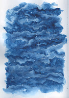
This kind of happened by accident. I noticed that if I put watered down white gouache on paper, then dotted watered down coloured (in this case pink) gouache, it creates a really cool affect. It produces shapes and a fluidity that you couldn't possibly produce by your own accord, it's totally unique. So I then scanned it into my laptop and played around with it on photoshop. 

I overlapped the two patterns over each other, then played the with colours. I think this looks quite cool, I like how each individual section is completely different. I also think it's quite obvious which song it relates so, because it looks psychedelic and floaty. But something isn't quite right about it..

Good mistake no.2 - just before I was going to submit, I thought I'd quickly have a play with the colours to see if it would improve my design and I am very glad I did! I think these colours pop out a lot more and personally I think are more pleasing to look at. I then showed my brother who is a big fan of Tame Impala and asked if this says Tame Impala to him and he strongly agreed which is reassuring. I think getting a second opinion of your work is very important, as you can miss out things that you hadn't even considered. 


Thursday, 21 January 2016

Substantial brief - Secret 7 - Set back

So after nearly finishing at last (my first almost completed secret 7) my computer decided to restart itself and not save any of my photoshop files, so I lost it. Which is actually really annoying as it is quite a set back on my mental time table of completing this brief. Although, I suppose it is kind of my own fault, because I know how bad my laptop is for restarting itself and I should have saved it before. Instead of getting annoyed about it, I'm just going to take this as a lesson - SAVE YOUR WORK ALL THE TIME


The only picture that I had taken of my design 

At least it didn't take me agggesss to do, so I guess it isn't the end of the world...


Tuesday, 19 January 2016

About the Author - Evaluation

OUIL504 EVALUATION

   I have learned a lot in this module that I will definitely take with me in later projects. I think the most important thing is time keeping. I really pushed myself at the start of this module, giving myself deadlines of when I wanted certain things finished by, staying in late to do so. I feel like I really hit a turning point, comparing to last year when I would do anything to not be in the studio. It really shows in my work, as I managed to get my prints and sting done before christmas, which felt amazing. I'm definitely going to take this into my next modules, as I've learnt how important it is to manage yourself properly - stress free! It's also taught me that I can actually sell my own work and that there's actually people out there that are interested in what I'm producing, which is so uplifting. It's given me more confidence in myself that I can actually be an illustrator and not scanning beans in Aldi - I just need to believe in myself more. 
  Skills that I've picked up during this module would include screen printing and using a wacom tablet. I would say that I'm probably the last person on this course to ever use a wacom tablet, I guess because I've always been so analogue. But I'm so glad I did, as it helped improve my final designs and is now something I can use in the future. As for screen printing, as disgustingly frustrating the process is, and it's safe to say I've come face to face with any kind of system error that could possibly happen, I like it. When it does go right, it looks amazing and so fresh. It is a very satisfying feeling and if I keep doing this process I will get better at it! It would feel like a waste if I never did this process again, especially as I do like my final prints, a hidden talent maybe.
  If I could do this module again, I would have tried to come up with more ideas instead of running with the first one that I liked. Even though I'm still happy with my concept and it works, I don't feel like I challenged myself with ideas. On a similar note, I wish I experimented with colour when printing, looking at gradients or mixing the colours together. Instead I just kept it orange and purple/blue through the whole process. But, then again, it works. I like the colours. I like to think of it as instinct and knowing this was the right thing to do instead of wasting time faffing with colour schemes when I knew ultimately that these colours worked best. 
  Leading on from not challenging myself enough, I also feel like I didn't in my animation. I know I keep having this endless battle in my head about this, but I'm still unsure on how simple I made my animation. I really didn't push myself, as I didn't struggle making it at all. But is it because I had good notes from the workshops and just took to the program quite easily? I could go round in circles.
  Strengths that I think my work consists of is the presentation, as I think I've labelled and laid out in a aesthetically pleasing way. This is something that I quite enjoy doing, because in the future if you're showing a company or business your work they're going to have an opinion on your work as soon as they see it, I think it's something very important to consider. I also think my prints are a strength of my work, as they fit the brief well and look great as a set. They may not be perfect, but that's something I've learnt from screen printing - it's not for perfectionists. Also this module has helped me a lot with my work ethic, which is something that can't really be taught. Because I enjoyed this module so much, I (for some reason) just kept wanting to do nothing but, staying till my deadline that I had in my head was completed. This module has made me realise that having a good time keeping and organised work ethic makes life so much easier, and makes you so proud of your own work. It seems a bit silly because it's obvious that you need good time keeping etc, but it's not till you actually manage to do it that you understand fully the importance. I will take this with me forever. 

About the Author - Issuu summery

Monday, 18 January 2016

About the Author - Zine

For the Thought Bubble comic book festival, I decided to base my zine on what I already knew a fair bit about. I thought it would be clever to use work from this module to put together a zine based on the fictional character 'The Babel Fish'. I already had drawings of this character in many different mediums, so would look good as a set of images. Even though I wasn't sure who would really want to buy this zine, I still decided to run with the idea. It meant I could do work for this module as well as creating the zine in time in a different area of our work.


Saturday, 16 January 2016

Small Brief - Penguin Random House - Book 2 - Roughs

Development


After looking at what is already out there, I started roughing my own designs. Like before, I found it hard to not come up with something quite obvious like footprints and magnifying glass. But as I carried on roughing, I found this character somehow appearing, which I quite liked. It stems from this weird piece that I did in first year that I think subliminally was taking inspiration from. 

My weird first year piece for visual language

So I took this character that formed and developed him further, working with gouache. 


Now I have this character, I need to think about what the front cover is actually going to look like. I know that after spending time on Emil, that I should probably have him at the main eye of sight. So I started drawing having this in mind. I also looked back at my first roughs and found something that I thought could work quite well. 


Friday, 15 January 2016

About the Author - Let's make more work for myself..

Because I had managed to produce my prints and sting before Christmas, I had some time to make some more prints that I could try to sell as a side project. So I went back to that dreaded print room to make some A4 versions of my Hitchhitcker's guide to the galaxy print. Am I crazy? Probably


As the process of screen print is so kind and always works perfectly I managed to produce 4 sellable screen prints out of 20 odd. Which is fine because Fabriano paper is really cheap and the whole process of screen printing isn't expensive or anything. 

Enough of the sarcasm

At least I managed to churn out some nice looking ones, and (hopefully) make some money from this! So fingers crossed


Substantial brief - Secret 7 - Tame Impala

I thought the second song to pick was a song I actually liked. In reflection I'm not sure whether this was a good idea because I think you should probably start with the hardest then work backwards. But I suppose I wasn't really sure what I was doing, so starting with the easiest can't be the worst idea in the world.

anyway

I looked at previous Tame Impala artwork on Pinterest. I'm already a fan of theres and know that their album covers are already amazing which kind of sucks.


I really like the psychedelic style that they've gone for, and I think it works really well with the tone of voice for the music. When I listen to 'the less i know the better' it makes me want to dance with my arms in the air swaying quite gently. This is what I'm going to try to recreate visually. 

Thursday, 14 January 2016

Responsive Collaboration - Creating a team

  The experience of having a full lecture theatre seeing my artwork was pretty scary. Even if most of the people don't know who I am or would remember my slide. It felt like I was in a weird creative dating website but we were all sitting in the same room together. But it was an experience nevertheless. Maybe it was just me, but I found it kind of useless having the presentation, as I just went to the table with the brief I wanted to do, then was put with whoever happened to be sitting there if I liked their work or not. Although I know some people privately messaged someone they liked the look of, so it could just be my case being different.

Anyway

I went to the Saucy Fish Co, as only one person was sitting there and it was one of the briefs that I was interested in. Another person joined and the team was formed! Luckily a lot easier then I thought it was going to be!


I am really excited to start this project, as my team feel quite strong - I can feel the dedication! I'm also excited to work with two graphic designers, to work with people that I don't know and have a different set of skills compared to me as an illustrator. Hopefully this will make us strong as a team, having a variety of creative knowledge.

Responsive Individual - Small Brief - Penguin Random House - Book 2 - Research

Emil and the Detectives 
Research

After doing the first book cover and quite enjoying the process, I thought I should give another one a go. I decided to choose the children's book, as I was curious to see if I could adapt my set of creative skills to produce illustrations appropriate for children. Even though, I actually have no personal interest in children's illustration, I thought that that shouldn't be a reason for me not to try - as I could really enjoy it.

I firstly did some research to see what were the current Emil and the Detective book covers. Although I wasn't really expecting much, as I knew this book was from around the 1930s, so didn't think I'd find many or any contemporary covers. But, I'm glad of this, as this was something I found hard about the previous book cover, too much current visual material!


For some reason, there seemed to be a sea of mustard yellow when I searched Emil and the Detectives into Pinterest. I'm not sure if there's a particular reason for this, or maybe they loved it in the 1930s. So I think maybe I should avoid using this as the base colour. By looking at these covers, I think using an analogue style would suit it best, maybe using gouache? or watercolour? I think I should collage it, so painting the figures individually then putting them together on the page. I think maybe that this would work well for a children's book design, but we'll see. 

Tuesday, 12 January 2016

Substantial brief - Secret 7 - At Last

It feels a bit strange doing responsive when I have a 504 hand in next week, but because I did well with my time management last term I'm not stressed and panicking now. So I thought I should use my time to start Secret 7 now so I'm not panicking when it comes to the deadline in March. Anyway,


I found this song the easiest to come up with an idea for, because soon as I listened to the song, it reminded me of a sexy lady singing in one of those smokey rooms with people sitting a loads of tables watching her under a spot light. It made me think of reds, pinks and purples and the shapes being very fluid and curvy.


I'm going to try out this idea on vectors to see if it works well, if not then I'll go back to the drawing board. 


Saturday, 9 January 2016

Substantial brief - Secret 7 - Discovering the tracks


The Tracks


> Clearest Blue - CHVRCHES
> At Last - Etta James
> Worry - Jack Garrat
> Art School - The Jam
> Imagine - John Lennon
> Dream 3 - Max Richter 
> The less I know the better - Tame Impala

I'm kind of disappointed with these tracks to be honest, well they're not the worst ever but they could be better. But I've set myself the task of doing them all so I can't really start complaining. I suppose it's best to have songs that I either haven't heard of or haven't listened to much, so I don't have a preconceived idea of what to do. 

Thursday, 7 January 2016

Small Brief - Penguin Random House - Book 1 - Final

FINAL


The actual final design! I am pleased with what I have put together, I think it would really stand out from the shelves. I did struggle a little with what to do on the back cover, I didn't want it to out do the front cover but didn't want it to be boring. I took the idea from one of my initial front cover designs. I think it works really well with the blurb, as it doesn't over distract. I think it terms of composition, your eye is guided from the milk glass (to draw attention) then follow it down to the writing which I think is successful, as you usually don't pay attention to the writing, but this way guides your eye towards it. 

But I think a weakness of this design is that it does include every single predictable symbol that is found on every other clockwork orange book cover which I said I would avoid... I'm not sure if it's because it's extremely hard to avoid it or I just have no imagination, I'm hoping it's not the latter. This has taught me for next time (if there's another book cover brief) to go for the obscure book with no film or much visual material, it is a massive distraction! 


Wednesday, 6 January 2016

Small Brief - Penguin Random House - Book 1 - Process


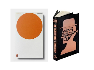
This is my first final attempt of the front of the book cover. Before I had a white background with orange and purple objects, but I thought a white background would be too boring. Then thought that the shapes didn't need to be two colour, as it creates more business which I don't really think it needs. 
I am quite happy with this. What I like the most is how I incorporated the type of the title into the face. I really hope that this makes my work stand out from the rest, because I think most people will just have the title at the top and author's name at the bottom like most book covers. I also hope that they notice my subtle addition of the male and female genitalia (to symbolise the sexual behaviour in the book), as again it will make my book cover stand out against the rest. 

I just need to incorporate the author's name and the newspaper's quote and maybe give it a bit of a move around.  

Tuesday, 5 January 2016

About the Author - Final Animation


After changing the background, I think it works a lot better. The face stands out a lot more than before as well as fitting better with my prints. I am happy with my animation, but I can't hep but think that I could of done more with it, that I didn't challenge myself enough. I have to keep telling myself that we're illustrators and it needs to be simple, so maybe I'm just beating myself up about it for no reason. 


If I did my animation again I would challenge myself more, using different effects and just having a bit more happening. I probably would have chosen the storyboard of zooming into different areas of the face and making them move. But I do like my animation, simple and effective? Hopefully

Small Brief - Penguin Random House - Book 1 - Process

I think the best way to actually create my book cover is on illustrator, as I am using block shapes. If I had more time I would like to screen print, but annoyingly I can't see myself having any unless I stop sleeping but I would like to keep that luxury. But from my new love of waccom tablets spawned from using them in the last project, I had got one for Christmas and I am very excited to use it. So just keeping it to vectors isn't the end of the world, plus it means I know it won't be pixilated when it comes to submission.


I used drawings that I had scanned in (shown in previous blog post) to trace, creating the vectored objects. Another thing that's good about using vectors is that I can easily move the objects around to see what area the work best in, as well as changing the colours, which is very practical. 

Annoyingly this is the only picture I took during the process, which I always do when I work on illustrator as I seem to get lost in the computer...

Monday, 4 January 2016

About the Author - Animation development


For some amazing reason, the making of my animation ran pretty smoothly. It didn't take me very long to put together, which I'm not sure yet whether that is a good thing or not.. Maybe it isn't unheard of for  things to go right, or is it just because I didn't really challenge myself by pre deciding that I wasn't amazing at animation.. I guess I could go round in circles thinking about this, but I'm pretty happy with my animation, as it fits the brief and my work nicely.


But I was told to change the background to just plain white paper to fit with my prints more, which is understandable. I just think it's a bit of a shame because I really like the texture that I created, but then again I could always use it for something else. Also the face does get quite lost in with the background and as it's the main feature of the animation it would be silly if you couldn't really see it. 


About the Author - Animation music

Luckily for me, my brother does music and was able to put something together for me that would fit my animation! Which was one less thing for me to worry about, which was great! I asked him to create something that was inspired by Pink Floyd, as Adams was a massive fan and he slipped the music into his work. Specifically, Marvin hums "Shine On You Crazy Diamond" in the original radio version, so I gave my brother this song to get the inspiration from, as I thought it would be the most relevant.

I'm pretty happy with the music, as it has definite Pink Floyd vibes. I wish that maybe it was a little bit more wacky and spontaneous, but then it wouldn't link with Floyd feel that I wanted. I also like having music that's totally unique and no one else has, not just because of copy right, but it feels more like my own animation. 


Sunday, 3 January 2016

Small Brief - Penguin Random House - Book 1 - Development

Development

Initially I struggled with coming up with roughs for the book cover. Because it has been done so many times and there's a film of the book, it was hard to bash those existing images out of my head. So I thought I should strip it back and don't over complicate the composition, sticking to simple shapes. 


I think I'm going in the right kind of direction. I like the idea of using the abstract shapes to create the face of the main character, like what I did in my previous module. Seeing as I have done this concept before, it will save me some time as I have learnt how to do this style quite quickly. It's also very contemporary which is what the brief asks for.

So I then carried on drawing, using the concept of creating the face made up with objects. I made a list of the key symbols from the book, drew Alex's face, then went with it.


Saturday, 2 January 2016

Responsive Individual - Small brief - Penguin Random House - book 1- Research

Research

The deliverables for this brief was to create book covers with a contemporary aesthetic and strong type. I was first  attracted to this brief as I had studied Clockwork Orange at school so already had fairly good knowledge of the book. I also thought that it had a variety of strong themes that would be easy to visualise. Although a downside to this is that it has been done many times before so was hard to not instantly come up with generic obvious ideas. So I did some research first.


I looked on pinterest to see what styles caught my eye and what I thought worked the best as a contemporary book cover. I think that this is the kind of direction that I would like my work to go in, working quite simply - using symbolic motifs. But I'm worried I'm going to produce something that might turn out looking quite generic and quite obvious. By looking at all the current book covers, very similar objects kept cropping up - clogs, eyes, glass of milk, bowler hat. I want to try to produce something that won't just be another clockwork orange book cover. 


About the Author - Animation development

First, I ran my idea through Mike to see how I could do it and gave me hope in saying that it wouldn't be too complicated to produce - yay! So I just had to make psd's of the different layers in the formed face, take away each element and then reverse it! boom! I am optimistic!

I was quite bored/fed up/didn't ever want to do screen printing for my animation so I went back to my old friend gouache, which was nice. So I made some textures.


On photoshop, I combined the textures with the shapes of my prints and cut out each shape so they were individual layers. Everything was going quite well so far, a bit scarily too well..

About the Author - Animation storyboarding

I decided to start doing the animation after I had finished the prints. I think that this was a good way to go about it, as the prints need to link the composition/design. Although, this was after a good few weeks of having after effects workshops so when I opened the program I did stare quite blankly at the ominous screen for a few minutes.

Anyway

I already knew I wasn't going to be queen of after effects, so went with quite simple storyboards. As long as they linked to my prints, were two colour and not absolute shit then I would be fine. I decided that panicking over this would be silly.


Storyboard 1
I like having the babel fish as the main focus of the animation, but it doesn't really link to my print. I also think that it is more complicated than my animation needs to be. Anddd it is pretty much the same as the short animation of the babel fish in the film, so what's really the point in recreating that.


Storyboard 2
I think this is the board I like the most. It's really simple but not too simple that it's just boring. It links to my prints really well too, so if they were displayed together they'd work as a set. I'm not sure how I'm going to put the elements together so they form the face accurately, but I'll get to that hurdle when it comes.

Storyboard 3
I do like this idea too. Very similar to the previous one, but with zooming involved. It would link to my prints, but is a fair bit harder than just having the elements come together, which I'm not too sure how to  create. I think it's best that I should stick to something that with a little bit of help I know I can do, especially as it's been emphasised so many times that it needs to be simple.

Responsive Individual - Substantial brief - Secret 7 - The Brief

THE BRIEF: Design album artwork for any of the seven vinyl sleeves - can do as many as you like
                      > Must not include artist's name or the title of the song

I have been waiting forever for secret 7 to finally release tracks for this years competition. I'm getting quite nervous, as I have decided for this to be my substantial before I have even known what the tracks are, good idea? not sure... But I had initially wanted to do this brief as I enjoy listening to music and thought it was a good opportunity to combine two of my interests. I thought I should challenge myself by doing all seven, especially as I had never created an album cover before. I'm hoping that I won't regret this decision, but I can't see that happening, it's only 7 designs!