Overall, I am very happy with how I have tackled the module aims, producing work that in first year I never would have dreamt that I could. It communicates, the visual quality is forever improving and finally I feel at one with my practice. And if I don’t get a good grade in the end then it doesn’t matter because I should be extremely proud of myself because I didn’t just complete the course with work that I am passionate and excited about, I managed to do all of that whilst battling with my headspace.

Sunday, 14 May 2017
Summative Evaluation
The whole reasoning for this module is to find out who we really are as illustrators and to professionalise our practice so we are ready to enter the real world with a superb portfolio that we would be proud to show off to industry. I am happy to say that this is exactly what I got from the module this year and I think I am finally at one with my practice. Although it wasn’t really an easy ride, and I think that I had to struggle for me to be at this stage where I am now. I pigeonholed myself straight away and refused to take on anything that I thought I couldn’t do without even giving it a go. But as the year went on I forced myself to try new things, I had to say to myself that all that would happen is that it might not work out but it can still go on my blog and I can concrete that it wasn’t for me. I’ve learnt is to try everything and don’t be afraid! Also experimenting with different areas meant that my portfolio would have more variety, and so more appealing to the industry. I feel that I have executed this successfully, producing a range of editorial illustrations, tackling not just politics but social affairs as well as sensitive subject matters.
Overall, I am very happy with how I have tackled the module aims, producing work that in first year I never would have dreamt that I could. It communicates, the visual quality is forever improving and finally I feel at one with my practice. And if I don’t get a good grade in the end then it doesn’t matter because I should be extremely proud of myself because I didn’t just complete the course with work that I am passionate and excited about, I managed to do all of that whilst battling with my headspace.
Overall, I am very happy with how I have tackled the module aims, producing work that in first year I never would have dreamt that I could. It communicates, the visual quality is forever improving and finally I feel at one with my practice. And if I don’t get a good grade in the end then it doesn’t matter because I should be extremely proud of myself because I didn’t just complete the course with work that I am passionate and excited about, I managed to do all of that whilst battling with my headspace.
Saturday, 13 May 2017
Rachel Maclean's new work

It's nice that has literally just posted Rachel Maclean's new crazy video 'spite your face' and according to the article it takes a while to digest... Which is intriguing because the exhibition that I went to see was by far the weirdest thing I've experienced so I wonder how she's managed to take it to the next level.
I did quite like looking at her work earlier in the module, but definitely now I'm at the end of the year I don't think it really is for me. I can appreciate it and I get that it's a good platform to express capitalism and social affairs etc etc, but what I really enjoy about producing work is that everyone would want to look at my work, and by judging my sister's reaction to her work (she walked out the room straight away) it isn't for everyone.
Emailing People of print

I had found people of print through Nicholas Andre, an illustrator that inspired me to create my Illustrated Mexico book. I really like the work that they showcase and would love to have their feedback or even any kind of interest in my work. So I sent them an email and attached a link to my website and images of my final publication. I really hope they respond, it would feel so amazing.
Emailing Printed people

I just sent an email to printed people sending them a version of my Illustrated Mexico concertina publication. Printed people promote creatives which they think produce amazing artwork, so I thought I could give it a shot to submit something to them! I said that if they had any suggestions on how I could improve then that would be amazing. I really like the work that they share on instagram so I would love it if they took notice of my work.
Friday, 12 May 2017
IT IS COMPLETE

I got my packaging printed a few days ago, but when I made my print into a concertina and put it together the packaging the width was like 2mm too short and the height was also too short by like 20mm! I really don't want to cut my print to make it fit because I think it would just end up looking messy and just shit.

So I went back and reprinted my packaging and made it bigger, which I was a bit apprehensive about because of my printing on Thursday wasn't exactly a smooth ride and ended up accidentally spending a bomb. BUT YES it only took me one try to get it printed! So glad that I finally don't have to battle with the printer again... And now my print fits perfectly in with my packaging! Like it actually fits like a glove I'm so happy with how it turned out in the end! Because stuff like measurements never go right for me (as previously shown). And even the little flaps at the side slip perfectly into the concertina so when you open the packaging you can also flick through like a normal book (refer to top picture).

I am so happy with how it all turned out!!!! It's completely different to anything I have ever produced in all of my three years ever! I'm really glad to have finished in this way and not producing something that I was half arsed about, it's like I went out with a bang! I can't wait to go out and show people my book!
last minute logo consideration
I decided that I needed a painting of myself as a little logo to put on my website and my Instagram instead of a photo of me. I just thought it would look more professional and just make more sense in general if i had a painting of myself rather than a photo. I wanted to make sure my instagram looks like a work instagram and not just one for fun.
I'm not crazy about it, because I'm unsure of the black lines because it's not the usual approach I have to my work and i don't really like doing my work this photo realistic... But at least it looks like me and I use the same colours in my work so that definitely works.

But for my picture I just did a section of it without the black lines, because I like the composition a lot better and I could fit my little name at the bottom (even though you can't really read it i know it's there and i like that).
Submitted to they draw & travel

I just submitted my work to They draw & travel, although I don't think my painting is exactly what they're looking for (because all the other artwork looks more like a map and has type on it) I think it still has the same purpose, it educates the reader on the country so I submitted it anyway. You also can have the option to sell your map through the website, which would be really great, even if they do take 50% it's good promotion to get my work out there. AND you can add your Instagram and website to your bio, so again more promotion!
Thursday, 11 May 2017
concertina book!!!

I was terrified of folding one of my prints because if i mess up that's like £8 out of the window so I had to be so careful with folding this. I also have a notorious past of fucking up when it comes to putting my publications together, I always accidentally fold it wrong or cut it in the wrong place or print it wrong and everything else. BUT! I folded it correctly and it works as a concertina!!!! I am actually really happy because I have never made one of these before (not sure why I've waited until my final major project where it really matters to try this out but hey). The ONLY thing which I'm a bit like meh about is that there's only an image on one side, it would look so much better if it was double sided. But because I had never done this before and James was doubting me so much about print stock and printing double sided that I really didn't want to risk it. I had visions of not even being able to get it printed so at least I have something I am quite proud of!
Joining WWD

I've been meaning to do this for such a long time!! I got told about it quite a few weeks ago now and just kept forgetting to join! If you haven't heard of them they're an open directory of female professional illustrators, artists and cartoonists. I sent off my application so hopefully I'll be accepted into this community! I think it's so great to be part of a collective, as well as finding illustrators that can inspire me and getting my own work promoted. It would actually be really cool if I could find some political editorial illustrators on here, because me and emily always talk about how crazy it is that they seem to be non existent which is incredibly frustrating.
(FEW HOURS LATER)


Yay! I have been accepted! Now I need to sort out my profile so I can use it properly to promote my work. I am excited to see how this goes with my practice
Packaging printing

I had a bit of a stressful day today trying to get my packaging printed... I had decided to print it myself in the illustration room because I had printed off my front covers for my sketchbooks in the uni printer and needed my wrap around packaging to be the same thickness so I thought it would be a good idea.
I had such a smooth ride printing off my sketchbook covers, but not my packaging... I just kept getting it wrong, putting the paper in the wrong way or not ticking the right boxes before printing, so annoying!! But after a bit of help and £6 later I eventually found out how to use the printer properly and all was well!

I'm not massively happy with the packaging. Well it looks good in the picture, but in real life I don't think it's amazing. I wouldn't mind if the stock was a little thicker and the front cover isn't as crisp as it looked on screen which is frustrating. But I really like the inside and I'm glad I've made a wrap around sleeve rather than have all the information on the back just to add another element to the publication.
Now all I need to do is make one of my prints into a concertina book, then it's complete!
Future plans

After uni I am planning on moving to Brighton because I have always loved the area, and it is full of creative opportunities where I can see my practice flourishing. After contacting Mister Phil about what it's like to be a illustrator in Brighton I am so excited! It just seems like the perfect place to meet other illustrators, have a studio space and opportunities to exhibit your work. I'm just so desperate to stay in the creative scene, there is no way that this is it for me, I just really want to be an illustrator. I know this isn't going to just fall on my lap and I still need to work on my contacting so I can get there. But first I do need to sort out my head before I start doing anything, because health is by far the most important thing and so that must get sorted first.
But I have thought about what I want to do. The plan for now is to get a part-time job that is at least kind of related to creativity, like managing festivals and creative events. Then on the side I'll be able to freelance and push my illustrations to industry and try and get as many commissions as I can. That's the plan anyway! I might be laughing at this in a few months time.
Wednesday, 10 May 2017
Paul Blow

An illustrator I actually really like!?!?! I find Paul Blow on my instagram feed and I really like his work. This one in particular is my favourite, I absolutely love the use of two colour and the use of light in this. I love any kind of illustration which is really clever with the lighting and incorporates that through colour, I think it's genius because you really need to develop your roughs to get it perfect otherwise it doesn't work. This is what I would love my work to be like, I really hope I can bring my work to this kind of level!
FMP packaging redo AGAIN
I've had to change my design AGAIN because I can't print A2 double sided I've had to try and adapt my packaging so it fits on A3 paper but will also be the right height to cover the book properly, stress! It's not going to look as good with the smaller side bits, but there's isn't a whole lot I can do about that. I'm going to print it tomorrow so we'll see how it goes...


Last weekly affair - anxiety - social media

Seeing as the point of this image is to educate/reassure people about mental health, it was quite important that I needed to share it on social media so I can get as many people as I can to see it. I was slightly apprehensive because I didn't want it to look like I was trying to get sympathy from it or for anyone to feel sorry for me because this happens to so many people and is a completely normal thing to happen. I got a really nice response from it and I really hope that it has reassured some people who have anxiety that it's okay and there's some amazing people out there who can help.
I also got asked from someone in fashion if they could use my illustration in their publication they're making on mental health with a statement about how I deal with my anxiety. This is really great as again it's raising awareness of it as well as promoting my work! Two amazing things in one!
Last weekly affair - anxiety - Tishk Barzanji

http://www.itsnicethat.com/articles/tishk-barzanji-illustration-100517
I found this artist on it's nice that and I love it. Initially I was drawn to the illustration itself, I love the pastel colours and the interesting composition and i always get drawn to illustrations with lovely lighting. I wanted to know more about the work so I read the article that went with it and I'm so glad I did!
The artist talks about his battle with anxiety and how he wanted to show the human side of isolation and anxiety. There's nothing more reassuring for something with anxiety to hear that others have suffered with it and how they overcome it how that came about. And this is the first time I've come across an illustrator that has had anxiety and how it effects their work. It's made me think how important it is for your work to be personal, because it can make people that don't even know you connect to it and that's so powerful.
I wish I created more personal work like this this year, because I only did one editorial and I suppose my fmp was personal but only culturally. Although just because my degree is over very soon, it doesn't mean I don't have time to do it! My practice doesn't stop here!
(if you have time read the article it's amazing)
Tuesday, 9 May 2017
Last weekly affair - anxiety - final image

Final painting!
I'm pretty happy with how this illustration turn out! There's a few areas where I don't think the proportion and perspective is that great, but for this image especially it's the communication of what I want to say which is the most important. And this is the part which I am really happy with. I find it really difficult to explain to people how it feels or how I deal with it, and this image is the best possible way I can show it to anyone what it's like. I also think I did it in quite a sensitive way without it being like a GCSE project with words like 'sad thoughts' and 'worry' coming out of the box. But this is exactly how I picture it in my head, as a dark smokey mass trying to consume me.
Last weekly affair- anxiety - development
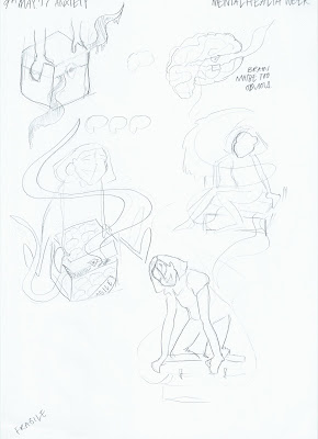
Anxiety is something that I feel doesn't get enough awareness. The word anxiety gets thrown around so much in day to day conversation that it normalises it's meaning and I think a lot of people don't understand the extent of it's abilities. So I wanted to show how it effects me and how I deal with it.
I found this quite easy to draw because this is exactly the image that I have in my head when I personally try to deal with it. There's a mini me trying to force these anxious thoughts back inside my mind box, otherwise they wrap around you and completely overwhelm and consume you. This is all happening whilst trying to maintain a 'presentable' exterior so not to worry others. And this is exactly what I want to illustrate.
My sister also has anxiety, so I sent her my drawings to see if she personally relates to the image, because I wanted to make sure that others who felt the same could easily relate to it. This is such an important reason for the illustration, I don't want it just to educate others into an insight of anxiety, but also for people who have anxiety to relate to it.

I wanted it to be clear that I'm really trying to force the box shut whilst keeping a calm exterior. This drawing looks too much like I'm trying to step over the box rather than closing it. So I adapted it slightly to make sure I can get across exactly what I'm trying to say.

final result!
One last weekly affair... anxiety
I know I had finished this brief a while back, but before I hand in my work I just feel like I have one more illustration that I need to do for this brief. Everyone always said that I should try to illustrate something a lot more sensitive and not political and see how I can adapt the way I work to it. I did adapt my work to not just be political but I never even tried to challenge myself in tackling sensitive topics.
It's mental health awareness week and for me a great opportunity to illustrate something extremely personal as well as challenging my illustration skills. I think it's so important to talk about mental health and that it doesn't need to be this awkward subject which gets tip toed around.
It's mental health awareness week and for me a great opportunity to illustrate something extremely personal as well as challenging my illustration skills. I think it's so important to talk about mental health and that it doesn't need to be this awkward subject which gets tip toed around.
Monday, 8 May 2017
PRINTED!!!!

I finally got my painting printed!!! cost an arm and a leg but I've got a few sold already so I'll quickly make my money back which is good. I'm so happy with how they came out though, the colours are perfect and so is the resolution! You can still see that it's painted which is what I wanted, I didn't want the colours to be really flat and solid because it kind of ruins the point of painting it. I printed it on a stock that's maybe a little too thick, but apart from that I am absolutely buzzing with how they came out!!
Sunday, 7 May 2017
Eye Mask

Another travel product!! This one is a bit more relevant than the travel mug I think because it is more specific to long aeroplane journeys. But I suppose that this doesn't really matter... The composition of the illustration works with the shape of the product which makes it more successful.
Tote bag/beach bag

Tote bags used by art students everywhere, but they're also used a lot as a beach bag and WHERE do they have a lot of beaches, MEXICO! So I thought this would be something good to apply my image to. Annoyingly the length of the illustration doesn't really lend itself that well to the shape of the product. But because there's so much going on in each section it seems to still work as a composition, so not a total application disaster.
Travel mugs?

Travel mugs!! This one was a bit of a no brainer really, it literally has travel in the name. The length of the image lends itself well to being wrapped around the mug too so quite a successful combination I think. I know travel mugs are used more like when you're in the car for 20 minutes going to work more than a 5 hour flight but the label of travelling can still be applied so I'm gona go for it.
Cardboard tube labels

For sending off my prints, I thought I should have a label that matched with all of my branding stuff. I didn't want it to be anything crazy because I don't want the postman to get confused when he's trying to read the address! But I still wanted to put my own little stamp (haha) on it. The address in the image is my home address so please don't send me any spam mail.
Ready for print!

I just got my document ready to get printed tomorrow (the print versions of my publication) for my orders that I got in! I am so buzzing to get these done! I triple checked to make sure that the res is good enough because I would be embarrassed to sell anything that wasn't perfect. I added my little Amy Illustrator hand written type on the bottom corner to make sure i got my little copy right stamp on there. I've never sold this many prints of my work before so I am so excited!!!!
Mural?

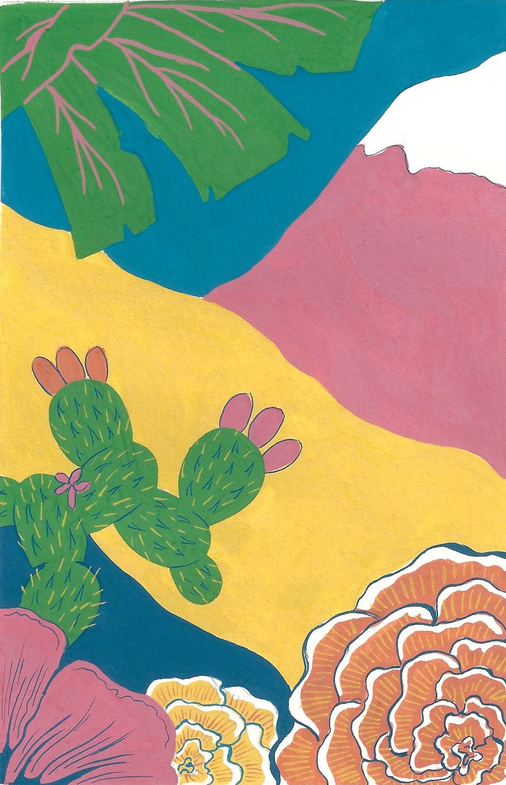
I think this mock picture is a terrible representation of what I wanted a mural version of my painting to look like, so i'm going to keep this post brief. Because of the length of my painting, I think it would lend itself well to a mural! I know i literally just said in the post before that I was going to look at travel merch... but I think this would well as a decorative mural! Also I have just thought that it could work in the arrivals walk way bit in airports (well just airports in Mexico) you know that long photograph where they merge all the iconic parts of that country in one long photograph?? This would actually work really well! My mum being in the picture might be a bit random in that context, but the rest would really work!!
Luggage tags

I would want my publication to be sold alongside some other ephemera that is relevant to the book, so seeing that this is about a country, travel merch is definitely something i want to incorporate to my range of products. Luggage tags is one that stands out for me for something that would be great to sell alongside my publication. They would also be really cheap and so easy to produce in bulk! I made a mock up version of what I would want it to look like, but if I have time I would like to produce some real versions.
Nobrow submissions?

I've just been looking at submissions to Nobrow, because I think my concertina book would fit with what they sell as they have a range of similar concertina books. But when I looked through the submissions specifications they only had two options of books to submit. One was short-form comics with very specific page numbers and size and the other long-form comics and graphics novels... my book doesn't sit with either of these but they seem to be the only options for submissions, so I'm not really too sure what to do. Nobrow definitely stock this kind of book though so I'm not sure how to go about contacting them about it... I might just send it anyways...
The graduates 2017

I just applied for The graduates 2017 through it's nice that! All I had to do was send a pdf version of my portfolio which was easy enough, so was definitely worth a shot! The winners get a feature written about them and a prime slot on the homepage and an opportunity to be part of the it's nice that team! That would be amazing! At least there's a few winners so there's a bit more of a chance of being chosen! Yay
Saturday, 6 May 2017
Response from Brighton illustrator! (Mister Phil)

It's a shame that PPP has passed before Mister Phil responded to me, but to be honest it's more important that he's helping me prepare for what to expect by being in Brighton than what grade I get in PPP from contacting people. Anyway
I'm so happy that he replied! Because this is one of the most important illustrators that I could contact for my life after uni, because he's doing exactly what I want to be doing in the place where I want to be. He was also so helpful! Sending me links to events and groups that I can check out, as well as a festival which is happening this month! It's making me so excited to be there and also really reassuring that I've chosen the right place, especially as a lot of people gravitate towards London and I feel like I'm one of the few who doesn't really want to be there.
He seems like such a lovely person, it would be great if I managed to meet him in Brighton at some point in the future.
Thursday, 4 May 2017
Back packaging complete

I finished the back of my packaging! This was the part I have been putting off for a while because writing formally isn't really something I strive in. But I actually managed to get it down fairly quickly and wasn't too stressful. I am happy that I managed to get a range of themes in, especially as I didn't have space to talk about every element of my big picture. It still could have been written better, but I'm at uni as an illustrator, not because I'm banging at writing.
I am buzzing to get this printed, but because of the weird sizes and double sided I am very nervous and to be honest it will more than likely go wrong, but that's life I suppose.
Wednesday, 3 May 2017
Portfolio is here!

I am absolutely buzzing about my new portfolio! It probably seems excessive to spend a bit of money on a handmade portfolio, but I really wanted something special because I will be using it for years so might as well! I also didn't want the same black plastic folder that everyone else will be having, if this means that I have something that makes me stand out a little then it will be worth it!
I didn't want something too colourful though, otherwise it would be distracting, so I went with just a bit of a statement orange, because I thought that would go nicely with a lot of my blue backgrounds.
buzzing
Postcards are here!!

I got some postcards ordered as part of the ephemera that would go with my publication, seeing as it's about travel it made perfect sense that postcards would be the best match. I am pretty pleased with how these turned out, but because I got them from the same place I got my business cards printed out I knew that it would turn out okay. The colours are really bright which I love because they are a bit muted on my business cards... I want them to be really eye catching and make people want to keep looking at the image to pick up all the elements within it.
There isn't anything on the other side of the postcard, but I don't think that matters too much. In fact, this makes it more versatile, as you can just give it as a little gift to a friend if you wanted to.
Tuesday, 2 May 2017
Commission (2) - Final image

I am really pleased with how this turned out!! Especially as I didn't really have a clue of what I was going to produce at the beginning which is weird for me because I almost always have a few ideas straight away. I am so happy with the colours in this illustration, I know pink is something that I use maybe a bit too much, but it works so well with the sludgy green of Jabba the Trump and red spot colours.
I'm just a bit worried about how the girl will feel about it because it isn't exactly what she asked me to do and it's another film reference illustration so I don't know if it is exactly what she wants so this is a bit of a risk. At least it isn't a total waste of my time if she doesn't like it because I'm really happy to have this illustration in my portfolio, which is really important at this stage. But to be honest I think it still communicates what the article is about so it should all be cool beans.
Commission (2) - colour scheme

Because i thought the previous colour scheme didn't work that well I thought I should come up with another strict 6 colour palette that would work specifically for this illustration. Because she said that her publication stock is quite dark I wanted to make sure that the colours would work with that as well as working with red, because she said this is the main colour that runs through the zine.
I'm looking forward to working with a different colour scheme because it feels like I've been trapped with my other one I used for my FMP for a million years.
Monday, 1 May 2017
Publishers?...

I was just looking at the resources on estudio and saw this list of small publishers (I promise I have seen this before now) and looked at each website to see if they would be appropriate for my book. I already know Nobrow of course and think that my book would fit in with what they already sell, so I definitely want to contact them. Apart from that to be honest I didn't think that the others were as useful, apart from fanta graphics, that looked a bit more relevant. Some of them I felt that my book wasn't professional enough or some of the websites were selling publications that looked too lo-fi... I don't feel like my book fits in!!!
I am desperate for people to see my book, so i'm not going to give up on this
List of briefs & illustrations completed
Just to get myself in check and see how much I've produced. These are ALL final images, not including developmental sketches and paintings.
Weekly Affair brief - self driven (One a week brief)
Illustration 1 - Louis Theroux
Illustration 2 - Trump & Hillary - singing Drake
Illustration 3 - Michael Gove revealed as killer clown
Illustration 4 - Marm-exit
Illustration 5 - Dia de los Trumpos
Illustration 6&7 - U.S. Election posters
Illustration 8 - Trump GIF
Illustration 9 - Shit Theresa May
Illustration 10 - Paul Nuttal
Illustration 11 - Mona Lisa - art a level saved last minute
Illustration 12 - Squid may become UK favourite meal as seas become warmer
Illustration 13 - Santa Trump
Illustration 14 - Ghost in the system
Commission 1
Illustration 15 - Ugly fur coat woman 1
Illustration 16 - Ugly fur coat woman 2
Illustration 17 - Veggie promotion poster
Illustration 12"
Illustration 18 - Solo - Frank Ocean
>This lead to a mini self driven brief
Illustration 19 - Sierra Leone - Frank Ocean
Illustration 20 - Sweet Life - Frank Ocean
Illustration 21 - Super Rich Kids - Frank Ocean
New Statesman Brief - Moby
Illustration 22 - Moby 1
Illustration 23 - Moby 2
Illustration 24 - Moby 3
Illustration 25 - Moby 4
Illustration 26 - Moby 5
Commission 2
Illustration 27 - Brexit article
Illustration 28 - Trump article
FMP
Illustration 29 - Big Illustration - the actual concertina book & front covers
Extra
Illustration 30 - Editorial - Not willing to pay creatives
Packaging - Front finished

After having to redo a lot of it, I managed to get it finished! I haven't put a lot of writing on it because it seems a bit unnecessary especially as it's just meant to be a picture book. So the only writing that I have is to explain who I am (on the pink side bit) and a short blurb on the back to explain the point of my publication, how the concertina can be used and who the audience is. I also made sure that I got my little copyright bit at the bottom, not just so it looks more professional, but I would be furious if someone ripped my work so also to help prevent that.
I just need to do the reverse side with the information about each section of the big illustration then I will be finished!!
Layout blunder

After I finished doing the front of my wrap around packaging I realised I got the front and back cover the wrong way round... Which is really annoying because this I lost more time which I can't really afford to lose. All I really had to do is flip the designs, but because the writing wasn't separate from the image I had to redo the front cover. This was the point where Photoshop decided to quit itself so I then lost most of my work and had to redo it, which is really great.
Commission (2) - Trump article - development/ideas
I was a bit stuck with this one. Obviously Trump is someone who I can effortlessly draw so that wasn't the problem here, it's the context. I didn't get given an article for this, which given from the previous article wasn't necessarily a bad thing. But all I had to go with is that the article is about how Trump has triggered a new wave of feminism, but this hasn't really been stated anywhere and think it's more of a conclusion that she had come up with herself. BUT DOESN'T MATTER I can work with this. I've never produced any feminist stuff before either which I am actually excited about so will be interesting to see how it turns out.

She said that what she had in mind was playing on the idea of mind the gap and have Trump teetering over the edge and have a crowd of women below with placards. So this is the idea I first started with, trying to use the cartoon effect of the love hearts coming out of the eyes, but I wasn't feeling it really.
I started looking at what kinds of things that people had on their placards so I could be inspired by that instead of just kind of drawing the same thing over and over again.

Then I saw this! This got my film application cogs turning... I didn't mean to do the film application again, but this just worked too well not to...
A star wars theme, trump as jabba the hut with princess leia on top of him holding this placard...
NERD ALERT NERD ALERT yes I know that the scene with Jabba the hut and princess leia is not from empire strikes back and it's from return of the jedi, but this works better and honestly if this bothers you then you need to get a hobby.

Sunday, 30 April 2017
Back cover design
Now that I've changed my design to the wrap around cover, I also needed to have a back cover, so I've kind of given myself more work to do. But it's okay! Because it's just the back cover so I don't need as many elements as I do for the front design. Also when i looked at the beyond the surface front and back cover, the back is just an extension of the front image but just the background, so this is the same idea I did for mine. It didn't take me that long so not too bad.
Printing & layout thoughts...

I was just thinking about how I'm going to print this book since James made me realise that it isn't going to be as easy as I anticipated... He said I can print double sided to a size that I can definitely work with, but when he said it might not match up that well, it's made me worry a lot.
I had a look at the concertina book that I have and how they tackled the layout and how the design adapted to it. I realised that the cover is separate to the main part and all the information about the image is within that card holder. I'm thinking that maybe I should do something similar...
I don't want to leave the back of my concertina big image blank, but i can have just one big block colour so I'll have no worries with the two sides matching! Then everything else can be with the cover which will help with the packaging, I think this is definitely what I should do.

Subscribe to:
Comments (Atom)