
Screenprint workshop
I was really looking forward to doing this workshop as this determined for me whether I'd be choosing this process for my finals. I've always enjoyed screen printing so I was praying that this would be successful! I also took this workshop as an advantage to test out this design to see if it compositionally works, so I didn't have to come in in my own time to do so - Time saving!!!!
Purple layer

Orange layer
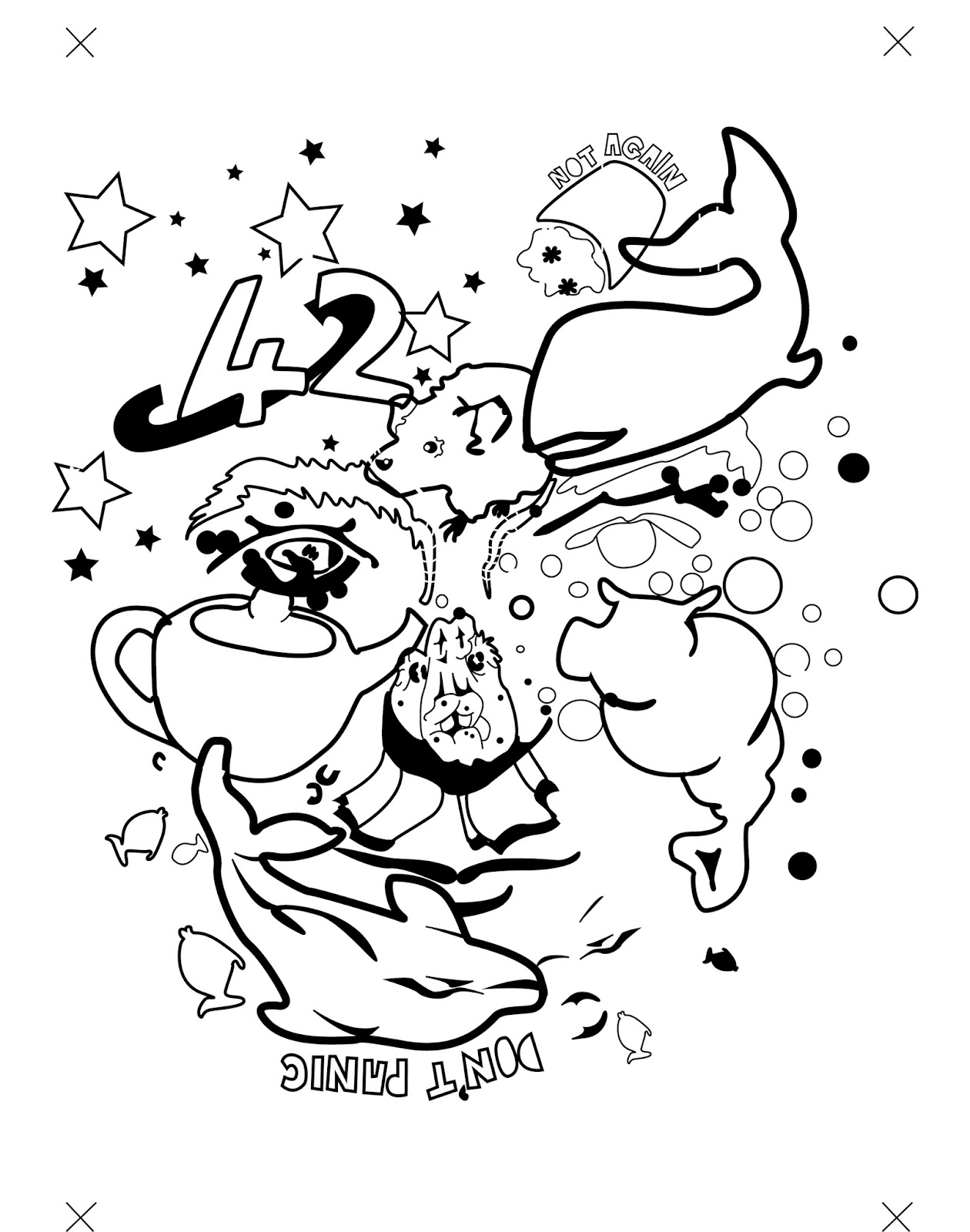
My positives and negatives
I scanned in my A2 drawing and put it into Illustrator - tracing it using pen tool. I wanted to vectorise my drawings so the print came out more clean and crisp. I also knew that it would make it easier to create the solid black areas, which is needed to produce a clearer print. I also quite enjoy using Illustrator, so thought it would be silly not to use a process I feel comfortable in.

Exposed screen

First layer - base colour

Finished Print
I was very happy with how the prints came out, even though most of them were out of alignment, I wasn't expecting them to be perfect as I have only screen printed this way a couple of times.
Having this test of my design was great, because now I know that I really need to even out the two colour ratio as the orange seems to take over the image. I also think that the use white/negative space works really well as a neutral zone between the two boisterous colours.
So I've learnt to improve my design I need to -
> Even out the colours - more purple!
>Maybe include more elements? Make it crazy!
> More white space in the elements

Orignal

Purple and greeny blue

Red and blue
To open up my choice of colour, I scanned in my print and messed around with the hue on Photoshop. It also saves me a lot of time instead of actually printing them all again in different colours - Time saving!! I think it's quite clear that the orange and purple definitely works the best as a colour combination, as they really compliment each other and makes the image pop! I think it's very pleasing to look at.
No comments:
Post a Comment