Saturday, 31 December 2016

Commission part2


After getting the approval of the design, I was excited to get started! But, things don't always work out the way you wanted them to... I got the flu pretty badly from 24th - very end of December, the days in which I wanted this commission completed.. Luckily the client understood and I still had time for the work to be completed by.

I managed to get this done in 2hours(ish), so didn't take up a lot of my time. I went to show the client the work over the professional use of social media and they never replied... this meant I was unsure about continuing the work, because it seemed like they didn't like what I produced so carrying on would have been a waste of my time. A few days passed and I decided to message the client again asking if it is what they wanted... it turns out they just forgot to reply... This is frustrating and is making me think is this what it's going to be like in the real world? Are people going to mess me around a bit? For now I'm just going to have to get on with it, time is running out!

Friday, 23 December 2016

Commission part1


I wanted to get on with it fairly quickly, because i had my own dissertation work to be getting on with and I knew I could quickly knock out these two illustrations. So I did a quick sketch of what I thought the client wanted with what she had briefed me. I sent them what I had done and they were very happy with the result! This is a really great feeling and a taster of what it might be like in the real world (well hopefully anyway)! Luckily they liked my initial idea saving me a lot of time, knowing straight away what I was doing so I could just get on with it. 

Commission!


My first commission! Timing may not be the best, but because my time keeping for my dissertation hasn't been that bad, I've got some time this christmas to do this work- and it's paid!! It'll also be good to be doing a brief that isn't my own for this module, as I haven't done or even attempted to do one yet. 
I've been asked to do a protest poster promoting vegetarianism as well as two illustrations of ugly women in fur coats. The only thing that is a bit annoying is that they have asked to draw the two illustrations in a typical fashion illustration style, which isn't what I do and what want in my portfolio... I think in the future I wouldn't say yes to something like that. I'd show my portfolio so the client understands my tone of voice and how i approach a subject matter, but because this is just for a friend, I don't feel like I can do it in the approach i'd want to do. 

Monday, 19 December 2016

Weekly Affair - Week 13

>Christmas edition<

This is a completely self indulgent attempt for this weeks affair... I suppose it is relevant as it is Christmas this week! But has no article and is my classic subject matter which I really should be trying to avoid because I don't want to just be that girl who draws Donald Trump. It also doesn't speak volumes and is pretty predictable, so I'm not that impressed by this attempt. 

Although I have really enjoyed painting onto the somerset paper I bought for my last weekly affair, and I'm definitely going to keep painting onto it. It creates such a lovely texture and adds another layer of depth to the illustration. 

Tuesday, 13 December 2016

Weekly Affair - Week 12


12th Dec BBC news Article: Squid may become favourite UK meal as seas become warmer
http://www.bbc.co.uk/news/science-environment-38265395


I wanted to do something a bit different for my affair this week (like I always keep saying). But I wanted to challenge myself with NOT including people in my illustration and NOT having it in the same portrait format. And I like to think that this was a success! It's important to work with a range of formats when thinking about editorial, because you would never just work in one format, you must create work that would work with a variety. 
I also realised now, and I have no idea why I haven't considered this before, the choice of stock is very important. For every other painting I have just painted on cheap paper that I found in the paper draw... But for this weeks (and for every other week from now on) I will be painting on a soft white somerset paper, which gives such a nice texture.  

Monday, 5 December 2016

Weekly Affair - Week 11


Something that isn't of Donald Trump or politics!?!?! woaaahhhh! I thought that I really needed to show that I don't just do politics and that I do actually have other interests! So I had a look through the BBC news website and tried to find an article that I would have a personal interest in and is for my generation. Within my searches I found this: 

"Art history A-level saved at last minute"
I thought this would be a great article to illustrate because it's about something I personally find very important and get very frustrated about when people don't take it seriously!!! I had also made a LinkedIn blog post about how Michael Gove wanted to get rid of a level art history, so to find this article was great! 


This was also a different colour palette to what I would normally use, but the greens and browns seemed more appropriate to keep the likeness of the original image, making it instantly recognisable. But I think for my future illustrations I should explore different colour palettes more, as I found this exploration enjoyable. I also think having a different shades of a colour with one spot colour which compliments the main colour is a successful colour choice. I think I will do this again in my future work also.   

>Application

Wednesday, 30 November 2016

Weekly Affair - Week 10

Paul Nuttall - Named new UKIP leader
A slight change of subject matter for this weeks affair - UK politics!? I'm getting a bit bored of being recognised as the girl that paints Donald Trump so I decided to shake it up a bit this week. Due to the disaster of last weeks digital attempt, I've returned to my old friend gouache. I really don't think I could work any other way now, it always creates the outcome I'm anticipating and now I'm getting faster at it time management for this media really isn't an issue.  


APPLICATION! Finally I have applied my work to some context! Although I doubt the BBC would be interested in my work due to it's nature, I applied my work to the article where I sourced my information. From my feedback, the question of how my work sits in digital format was brought up, but I don't think it looks too out of place? I think the texture of the paint and paper adds more character to the illustration, whereas digital can be a bit flat and lifeless. 

For next week's affair, I think I should try and illustrate something that doesn't link to politics for once! I need to explore my subject matter in greater depth instead of pigeon holing myself which I know I keep saying and don't do anything about it but I will next week!!!


Sunday, 27 November 2016

Why stick to editorial?


After researching for my COP3 practical, I realised that I shouldn't just stick to editorial as my discipline. I think I could also do publication, as my book for last years cop practical was a success and I'm currently really enjoying producing my book for this years practical... I think i'd be an idiot to ignore this, so I would like to try and produce a publication at some point for this module.

I also enjoy putting text with my illustrations anyway, so including my writing with my illustrations would be something that could be quite successful!

Monday, 21 November 2016

Weekly Affair - Week 9


This week I attempted to work digitally for my weekly affair brief, because it is far quicker than painting and quick turn around is something that is important in editorial. But, as you can see, it's the worst thing the human eye has ever seen. I didn't want to put it on my blog, so I put it as the smallest size image possible. Everything is wrong with this. It's so pixelated it makes it look like I've made it on paint. The lines are too thick and too wobbly it looks like a child has done it. And so because of all this, you can't even see what I'm trying to illustrate. Embarrassing.

I even tried extra hard this week because I actually found an article to illustrate instead of just a general well known news story:
Article Title: Is this the PM's 'white heat' of technology moment?
If Theresa May's CBI announcement of £2bn for research is truly new money and depending on the strings attached - this intervention could go a long way to cancelling out any potential financial cost of Brexit. It would not on its own, however, make up for the possible loss of collaborations with EU scientists following Brexit.

So I saw this as money being taken from somewhere to found scientific research to kinda make everything look like it's okay. That's the kind of thing I was going for. I didn't find it hard to generate ideas for how to illustrate it. I wanted to explore using three different frames instead of just the one spot illustration, because it worked really well for my michael gove clown illustration I did a few weeks ago. That element isn't too bad, and i think i should try and do this more successfully in later illustrations. I also like the colours I've used, but that's about it on the positivity.

Next time I think I'll go back to what I'm master at and try again to do a newspaper article. 


Friday, 18 November 2016

Peer Review - 18/11/16

Feedback

 I found the feedback session helpful, it was good for some different opinions on my work as I feel like i've been looking at it for so long it's easy to overlook things. It has also been useful to see how other people have approached and presented the briefs that they have chosen. It has made me realise that I really don't develop my initial ideas enough and just jump into creating a final image which could have been so much better if I took longer to think about it. I also need to put my work into context instead of just illustrations in a folder, as much as I like them and I'm happy with most of them, they're not applied to anything (minus the stickers and election posters).  

6A3: Research -
>Illustrate a specific article/news story and then put your illustration into that context 
>Change the subject matter - doesn't have to necessarily be focused on Trump or even politics - what else am I interested in? 

6B3: Problem Analysis - 
>Choose an article which may be more sensitive and see how i can go about attempting it - I'm used to satiring everything, how would I go about a different tone of voice? 
>Try and explore formats - full page spread, spot illustration - how does it fit in an article? 
>Try digital? - in the editorial world there's a quick turn around - i can produce my work a lot faster if it was done digitally. Even if it doesn't work at least I have tried.

6C3:Visual Quality - 
>Digital Experiment - how does working digitally effect the way my work looks aesthetically? 
>More roughs to improve compositions - but this has already been brought to my attention and I am now doing more roughs

6C4: Technical Competence - 
>Mastered gouache 
>Place work in context - where does my work go??

6D3: Evaluation - 
>Make sure blog is up to date 


Tuesday, 15 November 2016

Weekly Affair - Week 8


Something a bit different for this weeks affair! Not the most interesting contexts - Trump is walking all over the world - but I haven't made a gif since first year so I wanted to try out something simple before I got ahead of myself... I'm glad that I did it! I think it turned out quite successful and works as a looped gif so that's a relief. I would make more gifs in the future for this project, but try to improve on the context of it because I don't feel like this illustrates much. 

Monday, 14 November 2016

Finding colours


This pickle advert just appeared on my facebook, but I really like the colours that they've used and it's inspired me for my own colour palette. I want to try and incorporate that pickle green along with the mustard yellow.

Gifs?

From what I've been thinking about in PPP about my market and realising that it's my generation which is heavily interested in the online world, gifs would be a great media to work with to create a buzz. I'm hoping that this would make a bigger impact to get people interested in my work and having the message spread!!! So I think for my next weekly affair I will make a simple gif and see what response I get from it.

Saturday, 12 November 2016

Colour Schemes

My usual choice
Something different?

I have realised in my work I usually follow the same colour palette  of blue and pinks, but maybe I should try something a bit different? I quite like the more autumnal colours, introducing oranges and lilac into the colour mix.

These three are so very nice together, they're so pleasing to the eye.


Wednesday, 9 November 2016

1215.today Competition brief


This brief that Patrick sent out today is something that I'm very interested in and think it would be perfect for my practice, especially as this is something that I have been doing weekly anyway! I just need to try and jazz up my CV and hopefully will be appealing to them! But writing about myself isn't something that I'm necessarily good at either, so this is something that I need to work on! But luckily the deadline isn't till the 19th December so hopefully I'll be all good by then!  This would also be such an amazing opportunity to do a paid job in something which I feel passionately about and love doing!


Weekly Affair 9/11/16 Election Day

The world woke up to some of the worst news since Brexit, Donald Trump is actually completely definitely president of America. I was so sure that this wasn't going to happen that I printed a third of the amount of posters of Trump winning than him losing. I still just can't believe this is happening. But, this can't stop me getting out of bed and promoting my work, as I'm sure Trump is a true believer of freedom of speech. So this morning I printed off a load of A4 and some A3 prints of my winner poster and went round the unis publicising my work.  Annoyingly it was heavily snowing so I couldn't even try to put some of my posters up outside. At least I can try and get some good out of the complete evil that has been sprung upon us, and will also give me more opportunities for my extended practice in the future.

Monday, 7 November 2016

Weekly Affair 7/11/16 U.S Election Posters

I thought I would be an idiot if I were to not do anything for the U.S Election results, as it would be trending worldwide. But what Matt was saying about how I haven't really shown my work kept going round in circles in my head but still wasn't doing that much about it apart from stickers. So I decided to make two separate posters (obvs because I don't know who's going to win) and on the day of the results go around the art college as well as leeds uni and leeds beckett and put up the posters. It would be the perfect promotion, everyone will be talking about it and (hopefully) will be seen by most!  


After having the crit with Matt it made me realise how important making roughs are for my work, because usually i'd just draw the first thing that comes to my head, which doesn't necessarily communicate very well. It also helps for proportion of the characters and the overall composition of the illustration.
 
Winner          


Loser
Instead of doing an illustration of Hillary wining, I did it of Trump losing instead. This is because if she does win then people would be happy that Trump lost, not because Hillary is president because she's still pretty corrupt. I'm happy with what I have produced! Because I also listened to Matt's advice and did loads of roughs before I started to sketch out my final design which I feel made them stronger. I don't think they're necessarily perfect proportion wise, but far better than some of my previous illustrations. I also love the primary colours, linking to the colours of the candidates and also making the two work great as a pair.

Colour pallet 

Saturday, 5 November 2016

David Foldvari


David Foldvari's work has made me think of how alternate angles of approaching the same subject can create such different artwork. Although his work is satirical like mine, by coming at it with a more angsty approach changes the outcome, which I actually like. I also like the use of type in his work which is something I haven't properly explored, but think it would be good to see how it would take my work. 

Friday, 4 November 2016

Weekly Affair stickers


After having a tutorial with Matt, it made me think about what I actually want to place my work, because right now it's just sitting in my folder closed off from the world. It's made me think about how I should promote and put my work out there and what works best for my material. I instantly thought about this image because I had already recognised how it would be successful as a sticker, so I made it as a sticker! I also put my twitter name at the bottom (which I'm now regretting because I have more Instagram followers and prefer that social media) but I am still happy with them. I'm going to put them around hyde park and hopefully will get some response from it! 


Tuesday, 1 November 2016

Weekly Affair - Week 6


This one isn't really an affair, but because it's the day of the dead today and Trump of course is notorious for hating Mexicans, I thought it would be quite fitting to paint him as a catrina. I really like this as a spot illustration and looks like it would work well as a sticker or just like as a symbol. I like how it doesn't need any explanation to know what is going on, because of this I think this is quite a successful illustration. I also love the colour scheme, the pastels and complimentary colours are so aesthetically pleasing. This is colour palette is definitely something that i'll do again. 


Friday, 28 October 2016

David Hughes


David Hughes similarly to myself works with portraiture. Although he doesn't just focus on politics which I think is something that I need to do, as I don't want to pigeonhole myself just yet. He also turns his characters into book covers which I am considering doing for the Penguin Random house brief. Our styles may be different, but I think I need to look at his process to help improve my practice. 

Weekly Affair - Week 4

'Marmitexit'

This affair is quite delayed, as the marmite scandal was two weeks ago. But this image had popped into my head so thought it would be a waste to not include it into my weekly affair project. I really enjoy working with gouache, I definitely prefer it to just pencil, although it does take me longer to produce. But the colours are something that I feel make it so successful and is definitely something I want to continue with and improve upon. 

Tuesday, 18 October 2016

Post session thoughts

After having this morning session it has given me a better understanding of what to do for my briefs. Before I was worried about doing live competition briefs such as penguin and secret 7 because it didn't really relate to my work. But now I've realised that I just need to tailor them more to my own interests so now I have a clearly mind.

Penguin Random House: Draw characters from the books provided (for 2016/17)
>I want to draw characters because this will help with my portraiture skills, even though they're not my usual subjects, it'll still help my skills
Then collect these characters and turn them into the book cover
>This means I'm still taking part in the competition

Secret 7: Focus heavily on one or two songs and make a selection of artwork from these
>I need to improve the amount of research I do before I create my artwork as this let me down a lot last year for responsive.
Give my illustrations a political/satirical focus
>So even though album covers aren't something that I am interested in going into, the context and subjects of my illustration will be the same. Also editorial is about interpreting text, so having to take a piece of music and then create a visual is somewhat similar.


Monday, 17 October 2016

Weekly Affair - Week 3

Michael Gove revealed as 'Killer Clown'

This is my favourite so far from the three. I think gouache is a lot more impactful than just a pencil drawing, although it does take me a lot longer. Anyway, the killer clowns have been all over the news causing immense disruption, so I had to incorporate it into my work. I had also read an article about Michael Gove YET AGAIN tearing apart the creative sector in schools by getting rid of art history for a-level - https://www.theguardian.com/education/2016/oct/12/last-art-history-a-level-axed-after-michael-gove-cull-of-soft-subjects?CMP=fb_gu So I had been extremely annoyed at him this weekend, making him the perfect candidate to be behind the killer clown mask.

Tuesday, 11 October 2016

Weekly Affair - Week 2

Trump and Hillary and excited for Drake's new tour

Second drawing for my weekly affair brief. This picture has been all over the internet so I couldn't resist drawing my own version. But I thought I'd give it an extra piece of weekly information as it was released that Drake will be touring, not like that should really be top news but oh well. So I combined the two together to bring two weekly affairs to one illustration, so I drew them singing a 'One Dance' duet. 

One a week brief - Weekly Affair

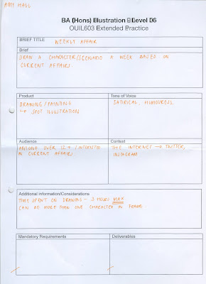
From thinking about my own personal practice, I think that the one a week briefs are going to be the best for my practice as editorial is something that I'm very interested in. So I wanted the one a week brief to be the most obviously relatable to my interest in political satire illustration and for it to explicitly be that. 


So I decided to do a character/scenario once a week based on the current affair of that week. I want my illustrations to not take more than a couple of hours to do, as in editorial work the turn around is extremely quick. I want to mainly work with pencil, but also gouache because it's what I work best in. 
I'm also hoping that this develops my character skill, so I become faster and anatomically better at drawing characters.

Wednesday, 5 October 2016

5 Statements... (Rationale)

> I want to...become a good editorial illustrator because... this is the field I am interested in, this means I will be able to... excel in that field.

> I need to... understand colour theory because... it will help my practice, this means I will be able to... create more impactful illustrations

> I need to... create work that I enjoy because... it's good for my mental health, this means I will be able to... produce more work as I enjoy doing it.

> I want to... become good at presenting because... it helps with my professionalism, this means I will be able to... use this skill in my future career.

> I need to... know how to get an agent because... I need someone to help get me work, this means I will be able to... be a more successful illustrator.

Monday, 3 October 2016

Initial Statement of Intent - Rationale

From thinking about my previous modules and what subjects I enjoyed and excelled in the most, I would like to explore editorial. This has made want to focus my briefs towards this area, with doing a few other different types of brief to keep my options open (like secret 7 for example). I also think that if I want to go into editorial, then the best kind of briefs for me would be quick turn around briefs as this would be similar to the line of work I’m interested in, making good practice. I found that there isn’t as many editorial briefs to that of publication or promotional campaigns, so I think I’m going to have to either adapt briefs or come up with my own rather than lots of live or collaborative briefs.

I want this module to keep me drawing and be an active illustrator rather than having to create work every now and again. I want to be pushed by deadlines and specifications to get me to the highest point I can be as an illustrator

Weekly Affair - Week 1

'If you haven't already checked out Louis Theroux's new documentary then get on it!'

My first weekly affair drawing is of Louis Theroux, because I have just finished watching his latest documentary on Jimmy Saville and as per always it was amazing. I think that the issues that he brings up and how you can relate them to either your own experiences or just general day to day happenings is something that makes his documentaries so powerful. Although my drawing isn't satirical, it's something that I still wanted to illustrate for that week because it really stood out to me and made me think. It's still character drawing experience anyway.

Sunday, 2 October 2016

Briefs I'm considering

ALREADY COMPLETED:
(2 mini briefs)

Talenthouse is a website full of quick competition briefs. These briefs have quite a quick turn around, which is what I wanted to capitalise in my practice. They also provide very different subject matters, which stops me from creating the same kind of artwork.

Self written brief - Draw a character every week - must be contemporary, a current person that's relevant to today.

Secret 7 - Album cover brief - Although I don’t have a great interest in doing album covers, I would like to use my portraiture and exploration of colour in this brief. I think instead of doing all seven (unsuccessfully), I will heavily focus on one or two so I can really get my teeth into visualising the song

Penguin - Similar to Secret 7, I don’t really have an interest in designing book covers, but I would like to use this brief to explore colour and portraiture. I would like to maybe adapt the brief so I could not just do the book covers, but maybe extra ephemera such as posters and small illustrations of the book.

Find articles to illustrate - I currently can’t find any live editorial briefs. So, if I still can’t find any within a few weeks, I would like to have my own briefs. This will consist of illustrating articles which are relevant and up to date as possible

Monday, 9 May 2016

OUIL505 Project Report

OUIL505 Evaluation

Initially, I was excited for the freedom this module brings, finally being able to essentially do what we've always wanted to do. But, the thought of it being a heavily research based module scared me, as this is the area that I always loose marks in. I really wanted to prove that I can do it, mainly for myself. I also knew that it would help me discover myself, so I did want to do as well in this module as I could. 

In this module, I have learnt some creative skills that I can bring into my future work. Strangely, I've learnt a bit about graphic design when putting together my cards. I think it is important as an illustrator to have at least a basic understanding of graphic design and vice versa, especially when it comes to type and layout. I've also learnt how to make my work look more professional, as this is the first time that I would show my work to a company and be proud of it. This is something that's very important for the future, as presentation is the first thing that a client would see.I’ve also learnt how to make stickers and double sided cards, which is a creative skill that I will need to have for next year, as well as helping me for PPP when it comes to self promotion. 

My strengths for this module I think has been my time management, as I've been so into the module that I haven't been wanting to do anything else but. There wasn't a point in this module when I was looking around at everyone else's sketchbooks and realising that I 'm behind. This is something that I want to try and keep up in all of my modules, as it increased the enjoyment for the process. I think another strength in this module is my openness to trying new things, as this is the reason why my outcomes became so successful, taking the risk of choosing editorial. I also think my visual quality of my illustrations is another strength, because they are the reason why the aesthetics of my products are successful. I think I've found a material that is best for my practice and now I need to capitalise on this in later modules. 

My weaknesses in this module I think is that I needed to do even more research initially when choosing which category of illustration to go into, as I think this is why I was so lost in the beginning. If I could do this module again, I would have given myself a better understanding of all of the options and routes I could have gone down.  

This module has definitely taught me a lot about my practice. It's taught me that I shouldn't stray away from an illustrative practice because I haven't done it before. I've found out more about myself as an illustrator, which has been the best thing I've ever received from a module in illustration so far. I've realised that editorial and product combined works very well for my practice, and more specifically doing political satire. I think that this is something that I might look into in the future after university for my work, as this is the first time I've been extremely happy with the final outcomes that I have produced. It's also something that genuinely gets me excited, and will even do research into to develop my knowledge further. Which, if you know how I work, is quite a big step for me, as research is something that I usually avoid. Finally finding an area that really interests me is amazing, I'm actually relieved, as so far on this course nothing had particularly come out to me of complete interest. 


It's also interesting to see that one of the first things I wrote down in my research book is that I said I'm definitely going sell my own work when I leave uni, and within a couple of months I know that this probably isn’t going to be the case. This shows that we are still in the learning process, and can't be for certain what's going to happen to our practice in the future. It also shows that you can’t disregard any options, even now, I still have another year to refine my practice. 

Sunday, 8 May 2016

OUIL505 Presentation Boards


OUIL506 Final Physical Products


OUIL505 ?!?!?!?!?

I quickly had another look on Trump's official website to look at any merchandise that I missed out, and found this?!?!


What the fuck is this!? This just shows hoe excessive these american campaigns get. It's just ridiculous!? Why would you want a jacket for your dog with a political leaders campaign on it!? why!?

I think if I had more time, I should have created some spoof mock ups of merchandise which would have linked more to the idea of excessiveness. But I can have this as a proposal for the future.

OUIL505 Proposal Redo

My initial proposal for this module has changed quite a lot compared to my outcome, so I redid it:

Saturday, 7 May 2016

OUIL505 Last minute application

I was so determined to make my own physical foam hand to go with my products, but the one I had ordered online hadn't turned up yet, so thought I should just make a mock up one online and come to face that facts that it wasn't meant to be. But! It came in the post yesterday!! Which is quite annoying because I had taken photos of all my physical products yesterday morning, so I couldn't professionally take photos of it. But, I had already spent £6 on it so was not going to go to waste!


This is the illustration that made me think to apply my work to a foam hand. I wanted to replicate one of them foam hands from the illustration, because I thought it would work really well as merchandise to go with the top trumps. 


I'm really happy with the result, because it links to the whole campaign theme as well as having a clear connection to one of the illustrations from my top trumps cards. The photo isn't the best of quality, but with it being so last minute I did what I could. Plus it's another physical thing I can hand in! 


OUIL505 Application mock ups - non physical

I wanted to make as many physical things myself, but some things I either didn't have time for or just wouldn't be possible. I tried to think of what would be most relevant to apply my illustrations to, and I tried to think of what people usually have for campaigns - badges, t-shirts etc. So that's the kind of route I chose. I also wanted it to be relevant to the trump cards that I produced, so that if these products were next to my trump cards on a shelf, it wouldn't look out of place.


Friday, 6 May 2016

OUIL505 Photographing products


Today I rented out all the photography equipment (lights and all) to take some professional-ish photos of my final products. We had the induction for how to use everything and had used them in the collaborative part of responsive, so was hoping it wouldn't be too bad. I was really excited at the start of the day, because I had never really taken photos of just my own work before,  and was looking forward to see how they would turn out.

These are the photos I've chosen to include in my design boards:


Annoyingly, we had the lights on too low a setting, and the photos came out a lot darker then what it looked like on the camera. But luckily it was easily fixable on photoshop, and I'm going to take this as a learning curve - photos look way brighter on the camera than on the computer.

I am quite happy with my photos, bearing in mind that I know nothing much about photography. I'm happy that I've got some good quality photos for my boards, as it will make them look more professional like they're a real product that I'm introducing to stores.


OUIL505 Editorial application?


I've been thinking about what Ben said in my tutorial about applying my illustrations in an editorial context, and thought that I definitely need to mock it up. So I found an article from GQ about the debate about trump having small hands meaning he had a small dick and applied my illustrations. I thought I should have a combination of full page and spot illustrations to see what works best. I quite like the full image, although I don't think my illustration is really appropriate for the GQ audience, it does link to the article. I think that editorial should be something to definitely consider in the future, which is a really weird thing to say considering I hated it last year. It shows how much your work can change within a year, which makes me excited for next year!


Not sure if this is definitely editorial, but I wanted to see how else I could apply my illustrations successfully. I thought maybe for an anti-campaign using billboards? I think my illustrations work quite well with the text and having hand drawn images instead of photos (which people usually use for campaigns) would work better to catch people's eye. I think this idea is something that definitely could be expanded on, but is a bit too late for me to do anything about now which is annoying... 


AMY ON 7TH MAY - I've just reread this, and maybe dropping the c bomb wouldn't be appropriate to be seen in a busy town centre shown in the picture. If I were to do this campaign then I would use my appropriate language for my audience.


Thursday, 5 May 2016

OUIL505 Final Crit


After the megacrit it was really nice seeing what everyone had produced, especially as everyone has gone so far from last year it's crazy! I didn't find the feedback incredible helpful because I had already printed my final stuff so already knew what I was doing. But it was nice to see that people really like what I've done which is great.

After having the group peer feedback today (which I usually find more useful than megacrits), it helped me think about where I could distribute my product. They came up with:
>Joke shops
>Forbidden Planet
>Urban Outfitters
>Magma

I found this useful, as I wasn't quite sure of where to place my cards and all the rest of the merchandise because they're too satirical for places that sell normal top trumps i.e. Wilkinsons. I have never heard of Magma so I think I should probably google.


I naturally clicked on the tag 'Trump games', and turns out they sell top trumps! Well trumps because they aren't created my 'Top Trumps'. I think my cards definitely can have a place here! As well as the rest of the merch that comes with it t-shirts, badges etc. Although they don't seem to push the satirical boundary which mine do, but they're still definitely not your bog standard trumps. The company 'Magma' seem to be pretty big online which I think would be good for my products, as this means people in the U.S could also find and buy my products.

Wednesday, 4 May 2016

OUIL505 May the fourth bring you stress

Today was definitely the most stressful day of the whole module so far. I was so excited to finally print out all my cards that took me ages to perfect, as well as my box packaging and my first time printing my own stickers. Alas, James was not in when I turned up to my print slot. So, none of the print guys that came to cover knew how to print off double sided. They also don't know how to print stickers, so had to scrap that idea. At this point my excitement turned into despair. After ten wrong printed out pages later, I finally had an almost perfect print. It's 2mm off being perfectly double sided, but I just wanted to get out of there and was the best I was going to get without James being there. At least my packaging came out fine…
Then a little bit of luck came, as they changed staff and the girl that covered them knew (kind of) how to make stickers so I ran down and begged if I was able to slip myself into the slot and I did yaay. But she wasn't really too sure what she was doing, and after a few misprinted sticker sheets later, I finally had them done!

Roller coaster

So because of this, I lost a lot of time. Spending 5 or so more hours longer at uni then I needed to when I could have been blogging or making presentation boards. I know it's hard to replicate James, especially which such short notice, but I don't think it's fair that our work has to suffer because someone else is ill. The system really needs to get sorted out quickly.

OUIL505 Ready to print

I've finally got everything ready and spell checked and ready to print! I'm really looking forward to seeing how these turn out and having them physically. This is my first time printing cards and stickers so I'm really hoping that it'll go well as I don't really know what I'm doing. But I told James beforehand and he told me how to lay out the documents so should be fine!

OUIL505 Final Cards

I've finally finished all the writing for my cards wooo! I thought it would be a lot harder than it actually was... I think once I got one down, the rest of them just started flowing out nicely. But I have to give a shout out to my brother and sister for providing with me with the Penis information and the Peeping Trump information. 

I'm so happy with how these turned out, especially as I have no graphic design experience, so laying out the cards was quite challenging. I'm glad that I made the illustration fill out most of the page, as it makes the cards more fun to look at. 

Tuesday, 3 May 2016

OUIL505 Front Card Design

I've finally got the front design for the card nailed!! After quite a struggle and a chat with Ben, I needed to keep reminding myself that the illustrations needs to be the main focus of these cards! So I changed the idea of having a circle into a rectangle that fills up most of the page. I also decided that I wanted all my cards to have the same format, so the illustrations that didn't have backgrounds, I used one of the illustrations that did and layered it so it looked like I had given them all backgrounds. This made it a lot quicker to do all the rest of my cards.

(this is a screenshot so the quality is the worst)


OUIL505 Front card struggles

I'm finding this part the hardest compared to everything else that I've made so far. I really don't want my cards to look like they've been made on paint. But I also need to remember, that in the real world if this was a job, I wouldn't have to be doing this and a graphic designer would do it for me. I'd just be doing the illustrations. But obviously right now I can't do that... So need to try and give it my best shot.

Buutttt because I always want everything to be/look perfect, I'm making this take a lot longer to do than it should... I'm hoping when I finally crack the layout of the card, then it's just a case of copying and pasting my new image into the next card and slightly changing the text.

I can do it!

I know this is terrible graphics, but I googled top trumps again to see the different layout formats, and I liked how this one has different sized shapes placed together. But I need to remember that I need to have my illustration as the main focus of the card, seeing as I'm doing an illustration course.

Monday, 2 May 2016

OUIL505 Social Media

I got twitter to try and grab the attention of Donald Trump or any kind of supporter to try and see what they would do. Annoyingly, nothing. I suppose only having twenty odd followers doesn't really help, but at least I tried I suppose!


OUIL505 Final Packaging Design

From the feedback that I received from my peer reviews and tutorials, I really needed to rethink the design for the front of my box, as it isn't exciting enough. I needs to be clear that I am taking the piss out of this whole stupid campaign and not trying to stick too much to the original top trumps design.

Originally this is what I came up with:

Which isn't thaat bad. But it definitely does still need more! I needed to make the colours brighter and the whole thing to be more comical!

The tutors and peers both said that I should put one of the spot illustrations on the front of the box, but when I tried this, it looked out of place. It looked like I had just stuck it on and didn't merge with the rest of the design. Instead, I thought of changing the stars which I originally had in the background and change it to a patterned version of the Donald Dump illustration. I also really wanted to include his hair on the front of the packaging, so I came up with including it quite subtly, but placing it on the top of the 'T' of the 'TOP' . 

FINAL OUTCOME:

I'm really happy with the outcome of my packaging. Bearing in mind I'm really not a graphic designer, I don't think I did a bad job on the type or general layout! I think it looks quite clean and professional, and you know exactly what you're getting from it. I could have put a big illustration on the front, but I think it would have ruined it. Plus I'll have all my illustrations on the cards inside, so don't think it's missing out on them at all. 

I can also use this for the back of my cards, which saves me a lot of time!! It also links better with the rest of the product, by having some similarity running through the designs. 

BACK OF CARDS: