Wednesday, 18 March 2015

OUIL404 Visual Language Evaluation

EVALUATION

>Which practical skills and methodologies have you developed within this module and how effectively do you think you are employing them within your own practice?
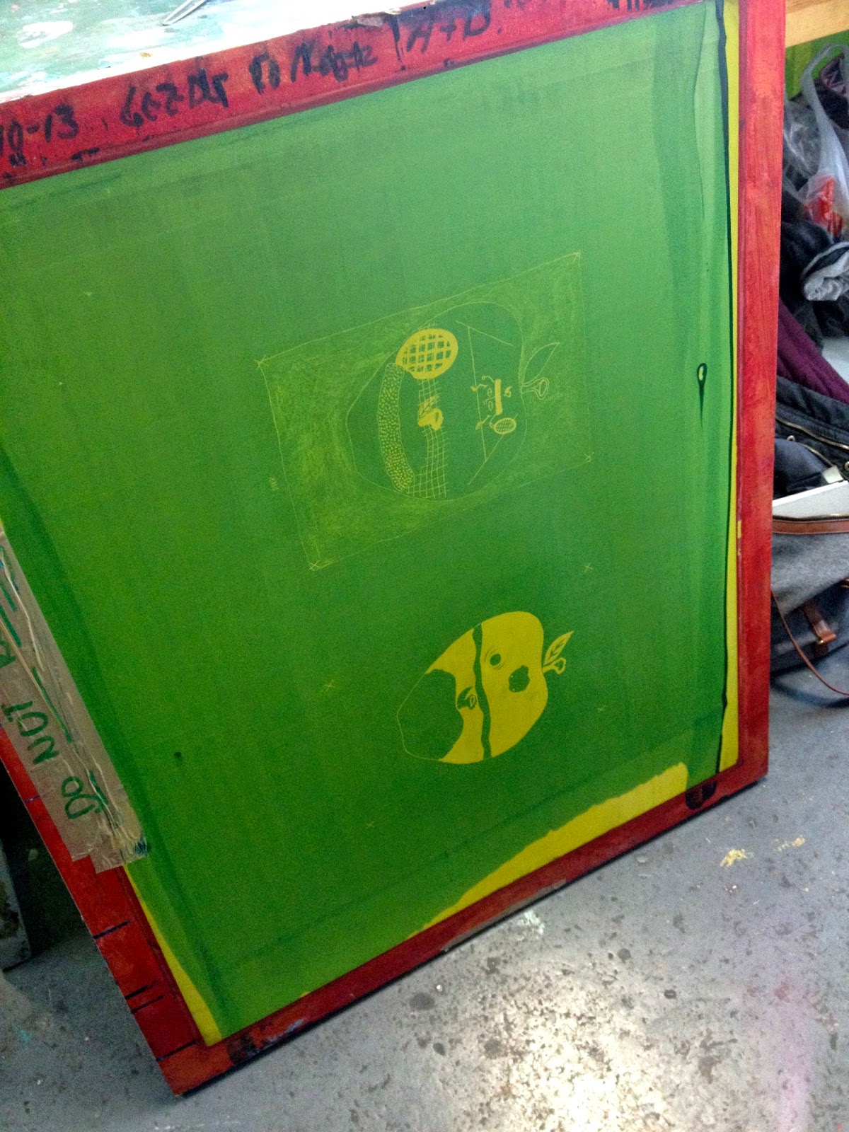
1) Photoshop is definitely a skill I have improved on over this module, learning new tools and found myself becoming faster at using it. Still using my handmade craft but then putting it through the photoshop process I found produces effective outcomes. This is also evident in my other modules, as more and more of my recent work was been produced using photoshop.

>Which principles/ theories of image making have you found most valuable during this module and how effectively do you think you are employing these within your own practice?
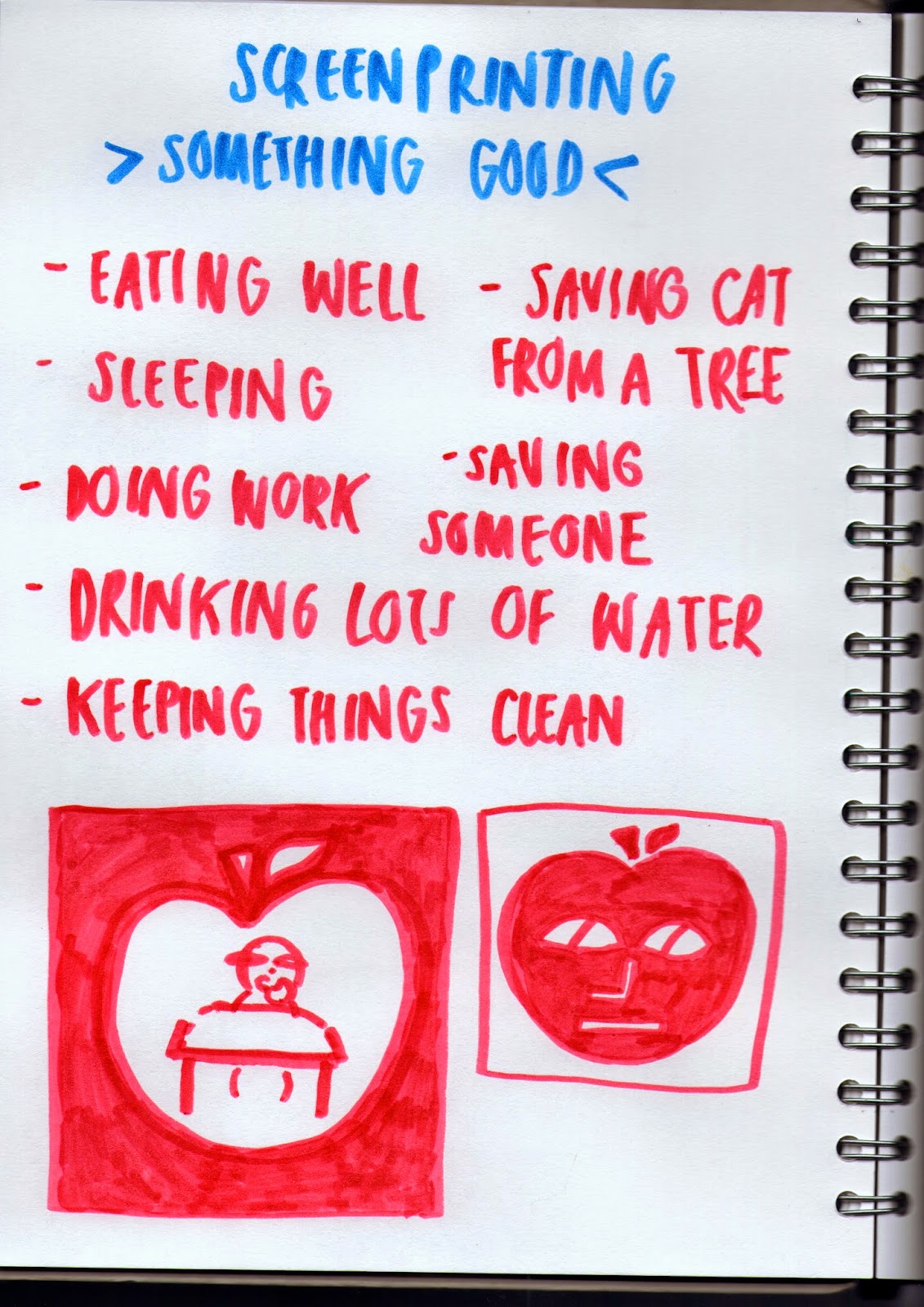
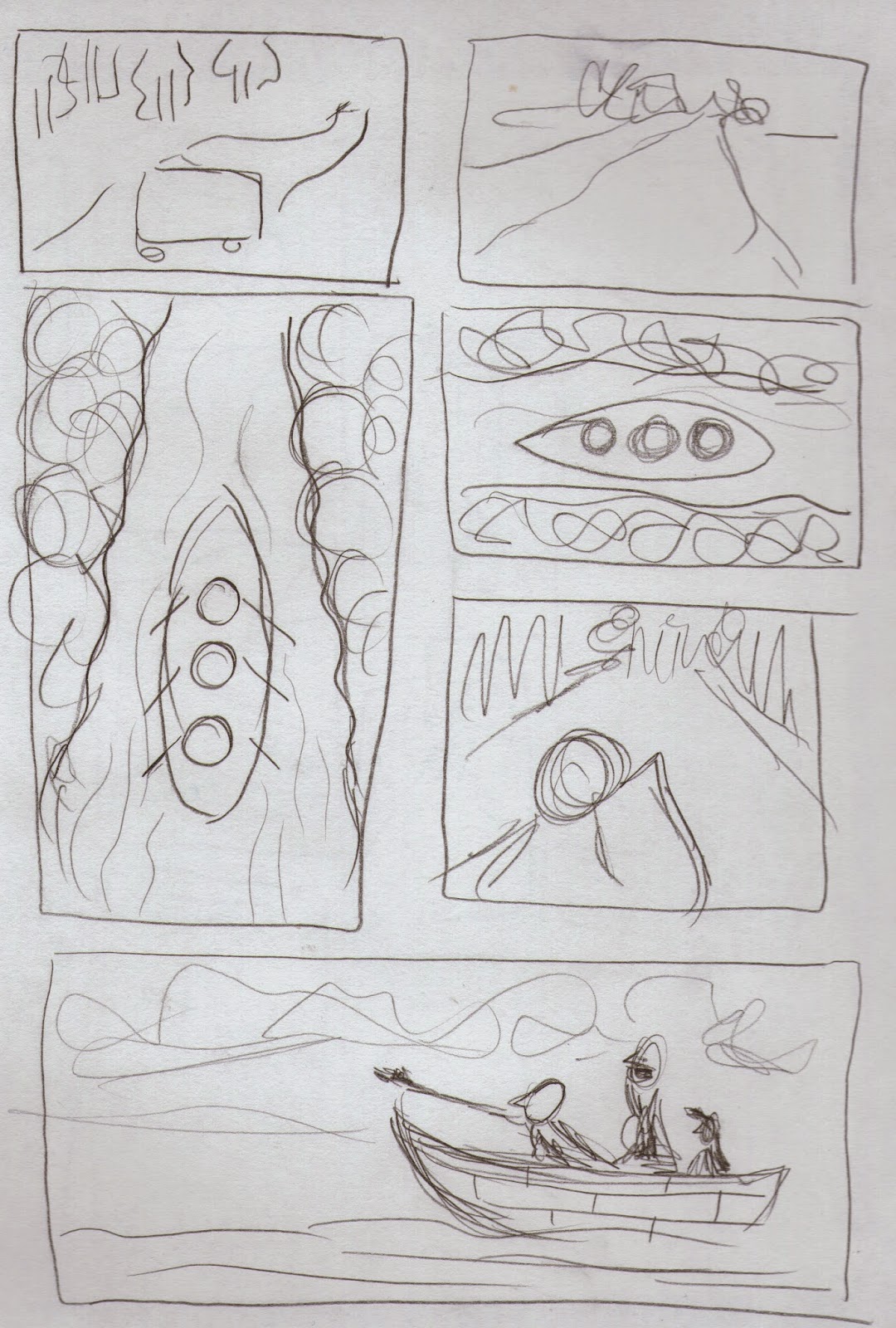
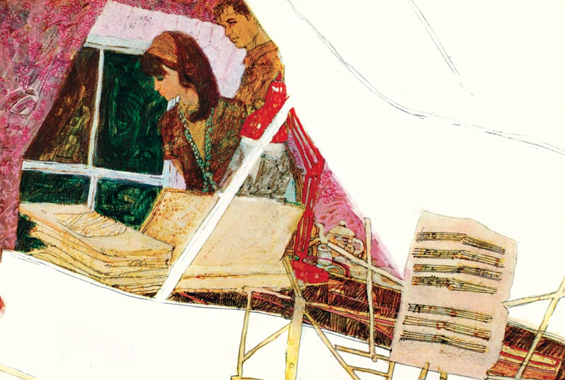
2) Learning how to create successful composition is a stand out theory of image making that I found extremely valuable. This was something that I once was totally clueless about, but now I find myself thinking a lot more about my work, producing lots of roughs and thinking about elements such as viewpoint, line of sight etc. Also using simple shape work in my practice is something I have found valuable in this module, making me realise that using shapes can communicate just as well as a detailed drawing can. This has also influenced my other modules, such as the GIF making and Illustrator postcards in visual communication. 

>What strengths can you identify within your Visual Language submission you capitalise on these?
3) My experimentation and willingness to explore materials is a strength of this module, as I tried to use as many different medias as possible to see what works best for my practice so I can employ them in my other modules. I also think that picking up on what I have to improve on is another strength, as I capitalised these after evaluating each piece and tried to teach myself to never do those things again. 

 >What areas for development can you identify within your Visual Language submission and how will you address these in the future?
4) My earlier work in this module seems to be a lot more rushed and a lot less blogging was written than the later, which is something I developed through the module itself rather than what needs to be addressed in the long term. Now I’ve learnt the importance of roughs and how developing ideas creates a far more contextual outcome rather than just the first thing that comes into your head (which is usually rubbish). However, I still don’t think I challenged myself as much as I could have, I think my compositions played it safe so fit the brief but didn’t amaze. In the future I definitely want to amaze instead of just doing what’s required from me. 


>In what way has this module informed how you deconstruct and analyse artwork (whether your own or that of contemporary practitioners)?
5) This module has made me think a lot more about composition. From analysing artists week in the last few weeks, I find myself going over the same process in my head - ‘have they used line of sight?’ ‘what elements did they use to create this?’ etc. In turn this makes me think a lot more about my own work, questioning my practice more than I used to. 

Colour Theory - Part 2


COLOUR THEORY - PART 2 
SUBJECTIVE COLOUR - COLOUR AND CONTRAST

Colour is contextual


  • Contrast of tone - Monochrome - light and dark values
  • Contrast of hue - distance between hues in a colour wheel - contrast - further away from the colour wheel = higher contrast.
  • Contrast of saturation - light and dark values and their relative saturations
  • Contrast of exstension - proportional field sizes in relation to the visual weight of a colour 
  • Contrast of temperature - 'warm' or 'cool'
  • Complimentary contrast - perceptual opposites - complimentary colours - harmony and discord
  • Simultaneous contrast - All of the colours combined - colours appear to shift and change - illusions


Colour Theory - Part 1

COLOUR THEORY
SYSTEMATIC COLOUR PART 1

WHY HOW DO KNOW THAT THE APPLE IS RED?
>Because it's the reddest thing that we can see on screen


>Colour  - wave lengths and perception
    - red, green and blue cones - fooled to see the other colours

>Colour is effected by the condition that it's in
>Colour theory was invented for us to understand colour.
      - Johannes Itten - 'The art of colour'

>Primary colours/pigments
>Complimentary - visual opposites
       - If they're mixed - they cancel each other out
                - neutral grey brown
                        - absence of colour

>Spectral colour
     - The eye can't see the difference between spectral yellow and some combinations of red and green

--Must remember:
RGB - FOR DIGITAL/SCREEN
CMYK - PRINTING

>Subtractive colour mode - CMYK - when mixed - reduces colours - black - PHYSICAL
>Additive colour mode - RGB - deal with light - increase - white light - OPTICAL


CHROMATIC VALUE - How to define colour
Hue + Tone + Saturation

HUE - Shade of colour - name of colour

LUMINANCE - Shades - darker, Tints - lighter = TONE

SATURATION - Tint - the amount of colour that's there

PANTONE - colour matching system

Colour

COLOUR
-Is complex and subjective
-Value - lightness or darkness
>What role does value play in planning composition? - mood
>How do we use these values to focus? - contrast, balance, harmony, mood - light and dark
>Commonly used basic value plans?:
- LIGHT AGAINST DARK
-DARK AGAINST LIGHT
- DARK & HALFTONE
- LIGHT & DARK AGAINST HALFTONE

NOTAN - B&W within an image can create harmony


  • DISNEY - simple palette, accent colour
  • TIN TIN - accent colour, colour effecting mood, harmonious colours
CONTRAST, ACCENT, COMPLIMENT, HARMONISE

TASK
>'Doing something good'
>A4 2 colour screen print

CONSIDER
>Frame, arrangement, viewpoint, depth, FMB, line of sight, value
>Character&figure, landscape, object


INITAL IDEAS
>The title of 'something good' is so wide that I didn't know where to start. I thought I'd go for something obvious that's good and then try and show it in a more abstract kind of way. I really wanted to challenge myself, as it's the last task and I also love screen printing. 

ideas
>I started with this apple character. Since the character brief in visual communication, character is something that I really want to pursue and delve into further, refining it by giving it more personality and a bit of fun. It also is made by putting together simple shapes, which works really well in screen print.


MORE ROUGHS

>Taken from one of my very first ideas, I really liked the idea of having the apple as the frame. It's something new and different as well as enhancing the healthy living message I'm trying to communicate. 
>I then thought that the apples should also be showing a healthy living lifestyle - so I made them play tennis. And so my idea was born. 

ROUGHS

>I then created rough after rough of apples playing tennis inside of the apple, making sure that it had viewpoint and depth in the image. I wanted to try and use as many of compositional elements as I could, so I can finally conquer composition! ROUGHS ARE SO IMPORTANT!


GOUACHE ROUGHS

>To see what colours would work best, I did a rough in gouache. I went for green because apples are either green or red so thought that one of those colours had to feature in the print. I then chose pink because of it being a complimentary colour to green. I also wanted to leave out white areas in the print for highlights, so you have that combination of dark, light and really light contrasting against each other. 


final composition
>After drawing and redrawing apples playing tennis for what felt like forever, I finally came out with a composition that I was happy with. 


POSITIVE & NEGATIVE

>I used various types of material for my positive & negative. I wanted to have a contrast in line work from very thick to thin and having block colour and scratchy pencil lines. I was very excited to see how these were going to turn out, because the good/bad thing about screen printing is that you never know the result until you actually make it. 


SCREEN PRINTING PROCESS

>I somehow always seem to forget how long the process for screen printing is, with a lot of waiting around for things to dry. But I love how you can turn a simple black and white drawing into a colourful print and I definitely want to do screen printing more often. 

FINAL PRINT

>When I noticed that my pencil marks didn't expose properly onto my screen, I was so gutted. But I felt like an idiot for not realising that the pencil marks were not dark enough. The only thing I should take from this is that to ALWAYS use jet black when creating the positive & negatives!! At least now I shouldn't have this problem again in future work.
>I also didn't flood my screen fast enough when doing my first pink layer, so it made the paint dry on the screen, enabling the paint to go through properly. Another thing that I felt like an idiot for not realising - THESE ARE BASIC THINGS! Luckily I addressed this in my second green print, so these came out bold and not patchy. 

-I will definitely learn from this and hopefully in later work I will have far more successful screen prints!

>Despite of this, I'm happy with how the image in the apple frame turned out. I like how I used negative space to bring out the two characters and used it as a third colour. I also like how the viewpoint makes it feel like you're standing behind the closest apple as if you're actually in this weird apple land. 
>It also still communicates what I wanted it do, showing a healthy living lifestyle which answers the task given. 
>It's a fun, playful illustration which I never would of thought I could create at the start of this module.


Line of Sight

LINE OF SIGHT
>What is it? - Direction in which our eye moves as we look at the image
>What does L.O.S do for your composition? - strengthen and clarified by more thoughtful use of line
-moves eye to main focus
>Movement?- curves, follow the curves
>Relationship with frame? - Can lead you in and out of the picture

>Make it a simple thing
>Colour effects L.O.S - creates a path
>Roughs!

CHOSEN IMAGE FOR LINE OF SIGHT:

Henri-Cartier Bresson
>Line of sight was a bit confusing to me when I had to look for an image depicting such. I knew it was about how your eye moves across an image, so I found a photograph that I could feel my eyes starting at one point and finishing at another and hoped it would be correct.

Everyone's images - arrow showing direction of line of sight

>During the session after I understood L.O.S a bit more, I could analyse my image a lot easier. The bought being the starting point and leading the eye onto the main focus which (I'm assuming) is the girl running over the bridge. Where is she going? Who is she? Why is she running? It starts to create questions and makes you think a lot more about the photograph instead of thinking "Oh that's a nice boat". 

TASK
>Transport illustration
-ROUGHS-
>Must include line of sight
>Any media - but must be B/W with one colour


initial roughs
>Transport is definitely up there in my least favourite things to draw. Making things look 3D and needing to make sure each element is in proportion and looks like what it actually is supposed to look like - terrifies me. However, I gave it my best shot and decided that a simple rowing boat would be best as I can make the shape fairly simple.
>With my roughs I first experimented with frame size and viewpoint, seeing which ones created the best L.O.S. 

roughs
>I decided to go with this rough, because I like how it is clear where your eye starts and where it leads to, which fits the means of the brief. The L.O.S is achieved mainly by the guy in the front of the boat pointing, as it makes you follow his arm then hand and then make you look to where he is pointing and makes you wonder what he's looking at. The curiosity is also added by his fellow boat friends, one being shocked at what they are looking at and the other trying to see what the others are seeing.

roughs
arrow showing line of sight
>I also started using blue ink, blue because very simply I really like the cool chilled feel that comes off it, as well as it being an image about the sea. I used ink because I wanted my image to be texture based, as I had noticed in the visual communication GIF brief that this works really well for me, so thought it would be a good idea to use the same process in this module too. 

RECYCLING OLD WORK

RECYCLING OLD WORK

RECYCLING OLD WORK

>When I started making my image, I thought it would be an economic idea to use textures and shapes that I have already used in previous modules. Especially, as these worked well in the first place I didn't see why they couldn't have a second appearance! 
>I also wanted to have a handmade feel to it with the textures, but just speeded up the process by using Photoshop. Another reason why I chose photoshop, is because I really want to get better at it. I can already see how much I've improved from my first photoshop induction work and so will try to use this whenever I can so I can become a photoshop wizard!

FINAL LINE OF SIGHT IMAGE

>I'm not too sure how strong the line of sight actually is, I do find myself starting from the left then leading to the right, but it needs a focal point. The arm is also a bit more like an inappropriate salute rather than just pointing... But I think it has potential and I did use frame and negative space when thinking about the composition as a whole.
>I think this is definitely one of the strangest things I've made, not even I'm quite sure what's going on...  But it's weird because part of me doesn't think that just because I'm not sure what I've created, doesn't mean it didn't work out for me. I think that this piece really shows how much I've learnt about how to create artwork, doing something I never would have created this in the first few weeks of being here. Experimenting with textures and shape, putting together busy patterns with block white - it strangely works.


Tuesday, 17 March 2015

Viewpoint & Depth


VIEWPOINT & DEPTH

DEPTH? - Illusion of distance/third dimension 
-Overlapping (FMB), perspective, size, cropping

VIEWPOINT? - Angle of how you look at the image - observe
-Realistic view - Highlights elements of focus

  • Sean Tan
  • Mobius
  • Laura Carlin 

TASK
>Composition - Three figures
-Depth
-Viewpoint

ROUGHS! 

Consider also - shape, line and texture


Depth and viewpoint - more things that I struggle with a lot. I've always found it hard to make my drawings actually look 3D, but then I realised that it's because I've never thought of it properly, until now. 


ROUGHS


>I wanted to choose a totally different subject, as native americans has bored me to death, as well as wanting to try something new.
>I really struggled when doing my first roughs (left) they just looked wrong but I couldn't work out what it was. So I decided to change the angle, because I realised from my last task that I always go for the side on viewpoint, so maybe doing a birds eye view would be something potentially interesting in how we look at an image. So I explored this further in roughs.
>I then used overlapping as another technique to show depth, overlapping the fish to show the depth of the sea.

roughs
roughs


BUT HOW AM I GOING TO DRAW THIS?????????
>I think where I've always gone wrong with composition is that I've chosen a far too detailed style for it to be successful, making it look too busy and taking so much time on something that can be communicated in a far more basic way.
With this in mind, as well as thinking about the shape tasks from a few months ago, I thought that using basic shapes would work best as they communicate the same to that of a more detailed drawing.
It's also something new for me so thought it would be great to get out of my comfort zone and see how successful the results are. 


FINAL

I'm unsure how I feel about the success of this illustration...
I like how...
>I've chosen a new viewpoint that I would have never thought about using before
>I've shown depth by overlapping the fish
>Doing a completely different style to which I would normally work - basic shapes and scribbled pencil. I don't think you could pick out that this work was mine if you look at all my other work. This also made me realise how you can use simple shapes to communicate instead of spending loads of unnecessary time doing each small detail, I definitely will use this again in future work. 

However if I had to do it again I would...
>Choose a different composition with more elements - I don't feel like I challenged myself enough, played it a bit too safe.
>Make the shapes look less childlike - I think it looks like it was rushed and not really thought through. I also think it makes it harder to really know what is going on in the image. 


Frame

FRAME
>The biggest element, central, contrast, cropping
>Express our picture idea more directly 
-Everything doesn't have to overlap
>Good for complex images
-Allows to organise information

CROP - edit, refine, compose

-We're constantly cropping and framing without even realising..  THE TAKE OVER OF INSTAGRAM 

  • Hokusai - size, slight overlap, crop
  • Saunders - crop, space (top right corner) - foreground been used as negative space
  • Caliaghan - overlap, busy, cropped, girls as focus

TASK
>Single image - you, elephant, butterfly
>Roughs - pencil
>Final - ink & brush

Roughs
 Because last weeks composition didn't turn out as successful as I hoped to be, I really wanted this one to work. So I started with creating lots of roughs, experimenting with different viewpoints and cropping and most importantly drawing out the frame first. I then decided that I wanted to use negative space and size to compose my art work, as I like personally really like the aesthetics of negative space in work, shown by artists such as Brain Saunders

Brain Saunders

roughs

roughs

This task made me realise how important roughs are to create an outcome with good composition and hits the tasks targets. When I had come up with the idea that I thought would be the most successful, I then drew it out again and again and again, refining each element till I was happy with it. Roughing is such an important thing that I need to keep doing, I can see such a difference in my work when I invest time into development, which seems like a really obvious thing to say but I think this has only just hit me. 


final
I am quite happy with my outcome, because I actually considered focusing on elements such as size and the shape of the frame which naively never really seems to cross my mind.. I also didn't get too caught up overthinking what I was doing, I tried to be playful and just produce something simple that hit the task given. I like how my image is split into half being divided by the contrast of the jet black and light grey sky, making the eye look at the painting in two sections (up and down). I also put the main focus in the middle of these two divisions as this is where the eye would be drawn to first which is what I wanted my work to do. 

Although if I had to do this again, I think I would have been more inventive with my viewpoint, as side view is always a natural go to view to draw from. Next time I want to see if I can experiment further with this to see what kind of outcome I create. 

Sunday, 15 March 2015

Composition


COMPOSITION

>What is composition? - the selection and arrangement of appropriate elements within the picture space. Express what the artist wants to say.
>What can good composition achieve? - Gives the viewer a satisfied sense of order and beauty.
>Four main elements - Frame, Depth, Line of sight and Value (shape & frequency)
>First thing to do when thinking about composition? - Place the elements as simple shapes
>What's the difference between sketching and making artwork? - Sketching is the starting point and artwork is the finished work. 

CONSIDER
>Foreground, midground, background
>Balance of colour and value
>Line of sight
>Negative space
>Perspective
>Viewpoint
>Overlapping objects
>Anything else that you feel, see, observe

  • Michael Kirkham - perspective, geometric, selective colour - block, subdued, flat
  • Robert Heindel - Bold bright colours, contrasts normal white hospital, angle, perspective 
  • Serena Katt - Colour shows mood - depressed, height order shows authority, line of sight

TASK

Design 5 different compositional sketches of the same three elements
>Figure
>Object
>Background (Landscape, scenery) 

ROUGHS!
A5

Ideas

>I was worried at the beginning of this task because composition is something I really struggle with. I can do something if it's just an object in the middle of a page but creating an illustration with lots of elements is quite scary and new for me. But, I was glad to be given this task because this is something that I definitely need to address and finally conquer!

extremely rough roughs

>I started by doing roughs, thinking about what we learnt in the presentation about only using very basic shapes to create the composition. Rotating the different elements around by changing the size of them. I also didn't want to make it too busy, because I think that simple compositions can sometimes be the most successful, as the eye doesn't get too caught up looking around everywhere. 

Roughs

Roughs
>I thought mainly about size and how that creates the perspective and FMB. I had the idea of having the horse right at the front and highly detailed then have the figure and background not very detailed and (the figure) really small and quite insignificant. 

rough drawings

material testing

>I also tested out different materials to see what ones would work best for my final artwork. I decided that pencil was too much of an obvious choice, so went to watercolour which creates a soft gentle mood which I thought worked well as I'm doing a sunset in the background. 


>I decided to split the image into two, so I could be more experimentive on photoshop and combine the two together and maybe make them overlap a little bit and see what I come up with. I'm happy with how the horse turned out, with the high amount of detail compared to the background and figures which is what I initially wanted. 


FINAL 

>When I first completed this I was happy with it, I thought that the overlay was interesting and different, giving it an abstract feel. But after looking at this more, there's many things that I would do differently now.

1) I think I should have just painted it as one big picture, there isn't really a need for the overlay. It would have looked more aesthetically pleasing if it was more realistic.
 2) The size of the horse is the only thing that the eye focuses on so much that everything else is just insignificant. 
3) It's evident that the time spent painting the horse took away time I could have spent thinking more about the composition and the aesthetics of the background and figures. I need to learn how to spread my time evenly over period given to make all the elements look as good as each other.
4) No narrative - another thing I really struggle with. I focus too much on something looking pretty rather than the actual concept/narrative behind the work, making it a nice to look at drawing rather than an illustration.


>Although this didn't turn out as successful as I had hoped, I'm glad that I've picked up on these things so I can learn for next time. I know I can conquer composition!! 


Saturday, 14 March 2015

3D Craft & Lens

3D CRAFT & LENS
>Object as image

  • Jean Jullien
  • Rita Ikonen
  • Polly Becker
  • Adi Goodrich
  • Marcus Oakley
  • Hvass & Hannibal

>Wild frontier of 3D illustration
>Place in context - conveying an idea
>Creating an ILLUSION 
>Photography is important - FRAME


TASK
>Imagine yourself as a mutant
>Specific superpower
>Be in the photo
-Props, location, costume


>I had no idea what to do with this brief, it completely baffled me. I thought it best to start by doing a diagram and stick to something simple like what I did over the christmas holidays and what I'm interested in. I thought if I over complicated something I wasn't really quite sure about then the outcome would be too confusing and not worth the time spent thinking about it. 
>So I picked a material that I am familiar with (paper cutting) and something I did a lot over christmas (walking my dog). I especially wanted to do this because I found out over the holidays that my dog doesn't have much longer left, so wanted to do make something about him.

Su Blackwell
>I remembered looking at the artist Su Blackwell back when I was doing GCSE, and thought that her style was something that I could be inspired by as it is 3D crafted and photographed with considered lighting and composition. I liked the idea of using something I already know and add more to it, so thought this would be a good style to work in.


>Initial images for pop out


>First draft photos

FINAL

>I am quite pleased with the way it come out. I like how the lighting is used to create shadows and brings out the lines in the trees. As well as this, I like how it creates areas of bright white and really dark, as these two contrasts make the elements stand out of the photograph. I also think that the use of material is different, as my paper cuts have always been 2D and flat, so using the same tool but slightly changing the process has been a unique experience, making me realise how the same materials and tools can create such different outcomes depending on how they're used. 
>A stand out fall back of this is that the picture quality isn't very good. As I left my camera at uni, I had no other option but to use my less than top quality iPhone to take the picture which is quite embarrassing. If I had to do this again I would definitely use a better quality camera as it really effects the way you look at the image, I think the quality makes this photo not that pleasant to look at.