
FRAME
>The biggest element, central, contrast, cropping
>Express our picture idea more directly
-Everything doesn't have to overlap
>Good for complex images
-Allows to organise information
CROP - edit, refine, compose
-We're constantly cropping and framing without even realising.. THE TAKE OVER OF INSTAGRAM
- Hokusai - size, slight overlap, crop
- Saunders - crop, space (top right corner) - foreground been used as negative space
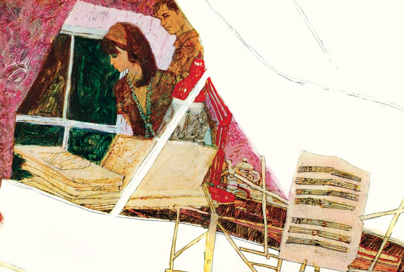
- Caliaghan - overlap, busy, cropped, girls as focus
TASK
>Single image - you, elephant, butterfly
>Roughs - pencil
>Final - ink & brush
 |
| Roughs |
 |
| Brain Saunders |
 |
| roughs |
 |
| roughs |
This task made me realise how important roughs are to create an outcome with good composition and hits the tasks targets. When I had come up with the idea that I thought would be the most successful, I then drew it out again and again and again, refining each element till I was happy with it. Roughing is such an important thing that I need to keep doing, I can see such a difference in my work when I invest time into development, which seems like a really obvious thing to say but I think this has only just hit me.
 |
| final |
I am quite happy with my outcome, because I actually considered focusing on elements such as size and the shape of the frame which naively never really seems to cross my mind.. I also didn't get too caught up overthinking what I was doing, I tried to be playful and just produce something simple that hit the task given. I like how my image is split into half being divided by the contrast of the jet black and light grey sky, making the eye look at the painting in two sections (up and down). I also put the main focus in the middle of these two divisions as this is where the eye would be drawn to first which is what I wanted my work to do.
Although if I had to do this again, I think I would have been more inventive with my viewpoint, as side view is always a natural go to view to draw from. Next time I want to see if I can experiment further with this to see what kind of outcome I create.
No comments:
Post a Comment