
COLOUR
-Is complex and subjective
-Value - lightness or darkness
>What role does value play in planning composition? - mood
>How do we use these values to focus? - contrast, balance, harmony, mood - light and dark
>Commonly used basic value plans?:
- LIGHT AGAINST DARK
-DARK AGAINST LIGHT
- DARK & HALFTONE
- LIGHT & DARK AGAINST HALFTONE
NOTAN - B&W within an image can create harmony

- DISNEY - simple palette, accent colour
- TIN TIN - accent colour, colour effecting mood, harmonious colours
CONTRAST, ACCENT, COMPLIMENT, HARMONISE
TASK
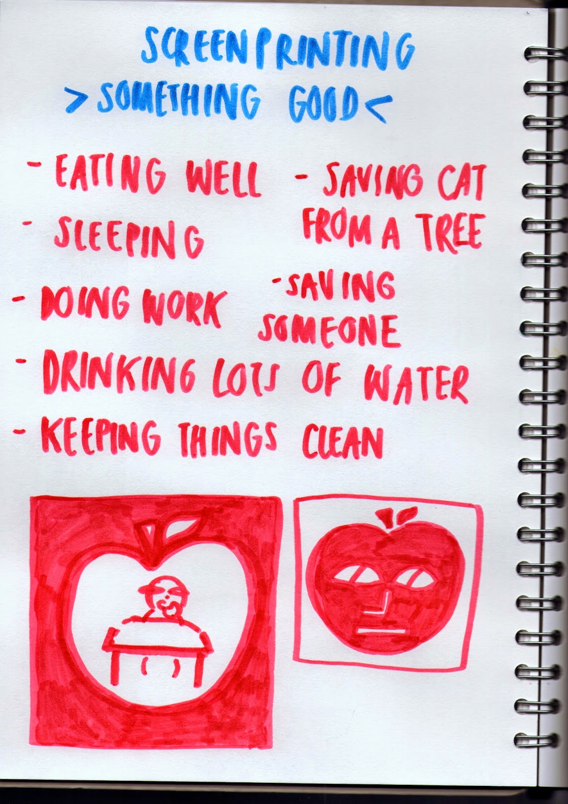
>'Doing something good'
>A4 2 colour screen print
CONSIDER
>Frame, arrangement, viewpoint, depth, FMB, line of sight, value
>Character&figure, landscape, object

INITAL IDEAS
>The title of 'something good' is so wide that I didn't know where to start. I thought I'd go for something obvious that's good and then try and show it in a more abstract kind of way. I really wanted to challenge myself, as it's the last task and I also love screen printing.
 |
| ideas |


MORE ROUGHS
>Taken from one of my very first ideas, I really liked the idea of having the apple as the frame. It's something new and different as well as enhancing the healthy living message I'm trying to communicate.
>I then thought that the apples should also be showing a healthy living lifestyle - so I made them play tennis. And so my idea was born.


ROUGHS
>I then created rough after rough of apples playing tennis inside of the apple, making sure that it had viewpoint and depth in the image. I wanted to try and use as many of compositional elements as I could, so I can finally conquer composition! ROUGHS ARE SO IMPORTANT!


GOUACHE ROUGHS
>To see what colours would work best, I did a rough in gouache. I went for green because apples are either green or red so thought that one of those colours had to feature in the print. I then chose pink because of it being a complimentary colour to green. I also wanted to leave out white areas in the print for highlights, so you have that combination of dark, light and really light contrasting against each other.
 |
| final composition |


POSITIVE & NEGATIVE
>I used various types of material for my positive & negative. I wanted to have a contrast in line work from very thick to thin and having block colour and scratchy pencil lines. I was very excited to see how these were going to turn out, because the good/bad thing about screen printing is that you never know the result until you actually make it.

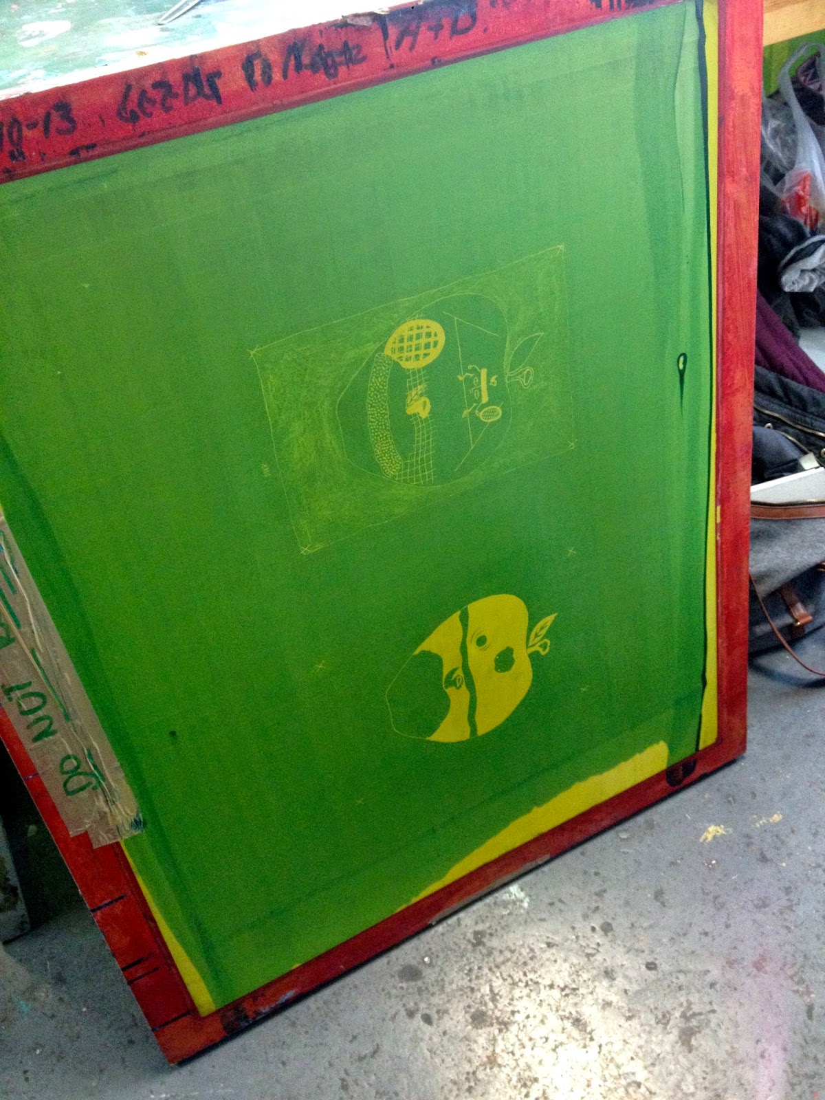

SCREEN PRINTING PROCESS
>I somehow always seem to forget how long the process for screen printing is, with a lot of waiting around for things to dry. But I love how you can turn a simple black and white drawing into a colourful print and I definitely want to do screen printing more often.
 |
| FINAL PRINT |
>When I noticed that my pencil marks didn't expose properly onto my screen, I was so gutted. But I felt like an idiot for not realising that the pencil marks were not dark enough. The only thing I should take from this is that to ALWAYS use jet black when creating the positive & negatives!! At least now I shouldn't have this problem again in future work.
>I also didn't flood my screen fast enough when doing my first pink layer, so it made the paint dry on the screen, enabling the paint to go through properly. Another thing that I felt like an idiot for not realising - THESE ARE BASIC THINGS! Luckily I addressed this in my second green print, so these came out bold and not patchy.
-I will definitely learn from this and hopefully in later work I will have far more successful screen prints!
>Despite of this, I'm happy with how the image in the apple frame turned out. I like how I used negative space to bring out the two characters and used it as a third colour. I also like how the viewpoint makes it feel like you're standing behind the closest apple as if you're actually in this weird apple land.
>It also still communicates what I wanted it do, showing a healthy living lifestyle which answers the task given.
>It's a fun, playful illustration which I never would of thought I could create at the start of this module.
No comments:
Post a Comment